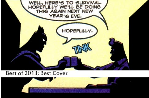
You know you shouldn’t judge a book by its cover, but that doesn’t mean you can’t judge the cover on its own merit. Some covers are so excellent that they back all the drama, excitement and emotion of the whole issue into one succinct image. Sometimes they end up being their own surreal experience. And other times, we’re just exciting to see our favorite heroes kicking ass one more time. These are our top 13 covers of 2013.
13. (tie) Wonder Woman 22 — Cliff Chiang

The shadow of New Genesis loomed large over the second year of Wonder Woman, and our only window to that world being the cocksure Orion, the planet had one hell of a first impression to make. Cliff Chiang throws his impression of their entire society right on the cover, opting for a graphic with limited color palette that calls to mind soviet propaganda posters. The issue itself finds Azzarello slowly doling out details about the various cracks in New Genesis’ sterling facade, but thanks to Chiang’s striking cover, we’re already there.
13. The Sandman: Overture 1 — J. H. Williams III
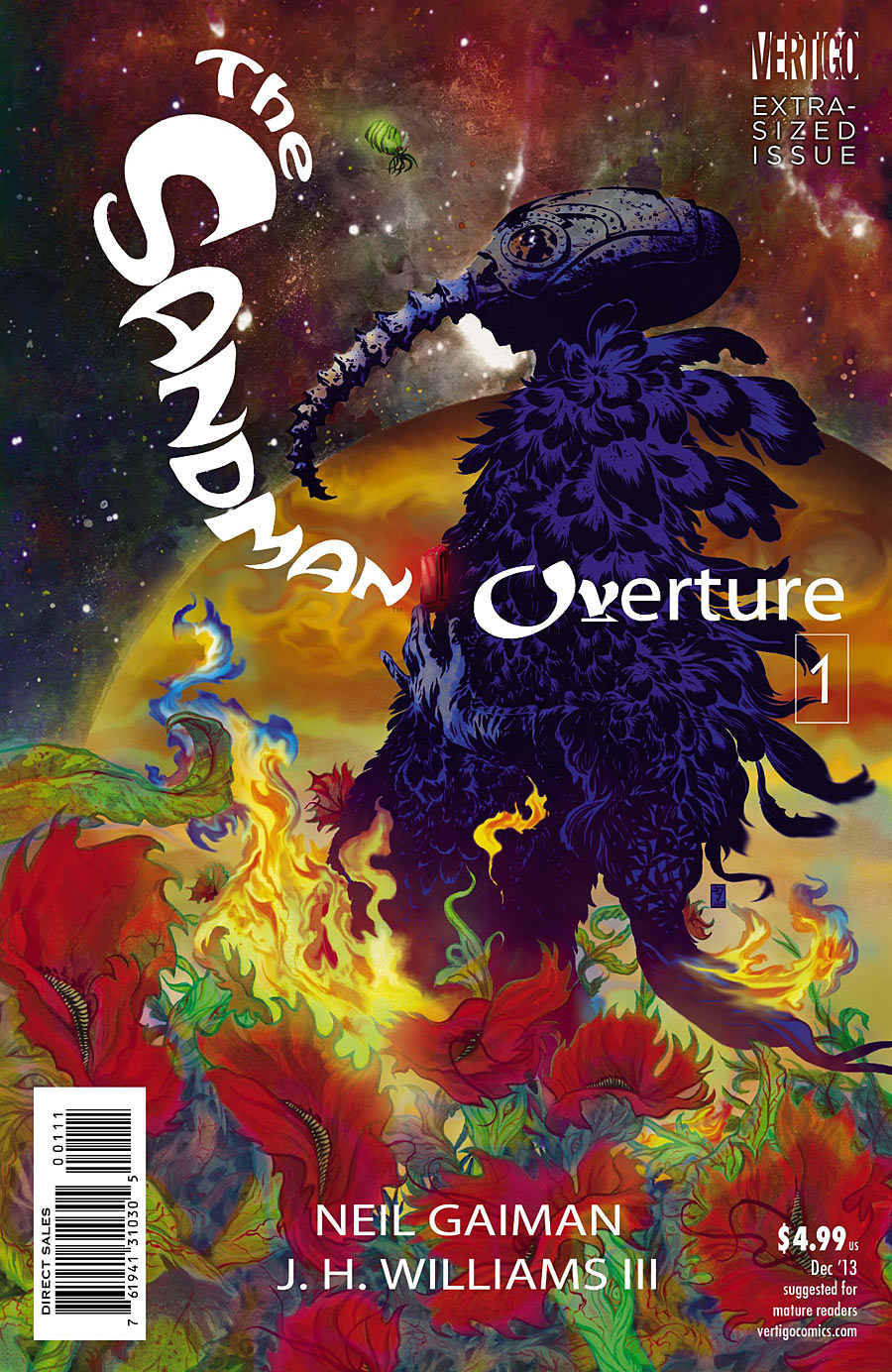
J. H. Williams III on Sandman is already a dream come true. There are no two names in comics as synonymous with beautiful ephemera as those two, and Williams seems hell-bent on leaving his sublime mark on Dream from before the story even starts. The scene depicted on the cover is an appealing jumble of images from the issue, with the framing device of the dreaming carnivorous flower creeping up around our hero’s legs. The promise is trippy adventure, but Williams’ craft also assures the reader that none of that surreal imagery will be squandered on nonsense.
12. Animal Man 18 — Jae Lee and June Chung

Oh, geez. We lost a lot of superheroes’ young sons in February, and while Batman and Robin got all the press, poor Buddy Baker was going through the same thing. Jae Lee — master of drawing characters head-on — shows Animal Man in a moment of unguarded torment, with no bells, no whistles. The darkness is so oppressive that it starts to creep in over Buddy’s feet, and any body part too far back to be properly lit by this impossibly dramatic spotlight. Buddy’s baroque red Animal Man tattoos persist — a constant reminder that his loss is also his own fault. Plus, come on, you can’t put a shirt on Animal Man: everybody knows that.
11. 100 Bullets: Brother Lono 6 — Dave Johnson
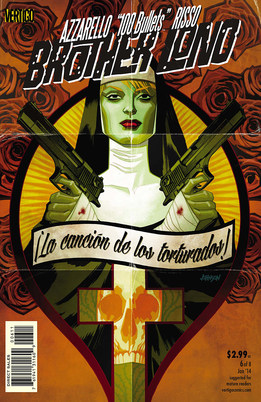
It takes a lot for a single image to stand up to the sheer volume of symbols at play in Brother Lono, but Dave Johnson — who also served as cover artist on 100 Bullets — is more than up to the task. Here, he crafts a masterfully dense image around Sister June, a “nun” we’ve already learned is actually an undercover DEA agent. That contrast allows him to find the line between Catholic and violent imagery, crafting a bitingly ironic hybrid of spirituality and pulp. It’s a dense image, but one that only whets the palate for the issue that follows.
10. Teenage Mutant Ninja Turtles 29 — Sophie Campbell
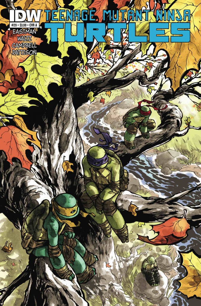
Sophie Campbell did the art for a handful of the TMNT microseries issues in the past, but issue 29 marks her first foray into drawing the main series. Her story arc is the tried and true Northampton story, where the Turtles sit quietly and lick their wounds. They’re recovering from the Mateus Santoluoco-drawn City Fall arc. We are well-documented as loving Santoluoco’s art, but Campbell brings a more vulnerable look to the series and this beautifully watercolored cover wears that vulnerability like like a badge of honor.
9. Pretty Deadly 2 — Emma Rios

We might have had a hard time articulating what actually happened in this issue, but we all agreed that the look of this series is absolutely spellbinding. The cover to the second issue borrows all of the young series’ visual motifs and swirls them into one epic hero shot. The camera is low, stalking through the unnaturally purple grass, and seemingly peering through plants that look as much like butterfly wings as they do like fox ears. Death stands in the middle, wreathed in a cool orange sky, a vulture slumped lifelessly over her shoulder. It’s an unbelievably loaded set of images, almost so much so that it’s impossible to tease a concise meaning out of it, but that’s Pretty Deadly for you.
8. Daredevil 26 — Chris Samnee and Javier Rodriguez
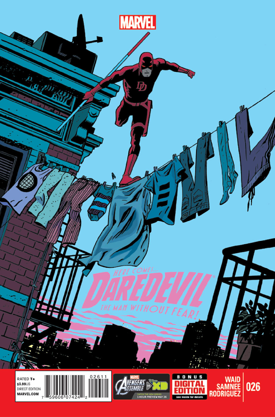
This one’s deceptive. At its surface, it looks like a pretty normal Samnee drawing of Daredevil doing something Daredevil does all the time. It is that — and the way the buildings are slanted to the right while Matt stands upright enforces some key themes of Daredevil losing control of the city — but the extra magic is in the clothes on the line. They spell out “Daredevil” in such a subtle way that you basically won’t notice it until some smart-ass points it out to you.
7. Batman/Superman 1 — Jae Lee and June Chung
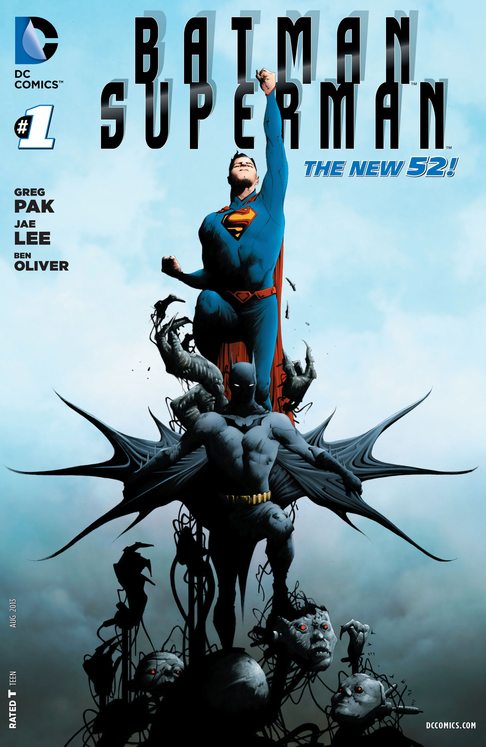
Hey look, it’s Jae Lee drawing characters head-on again! If it ain’t broke, right? There’s a lumpy symmetry to this cover, which is made even lumpier by Superman’s single fist in the air. In fact, Batman appears to be the most stable part of this image, suggesting that both Clark and the threats from Apokalips are throwing him off his game. Also, while we grew tired of his over-use of shadow by the end of issue 3, depicting Bruce’s face in shadow and Clark’s face in direct sunlight sets up another fundamental difference between the characters.
6. Hawkeye 8 — David Aja
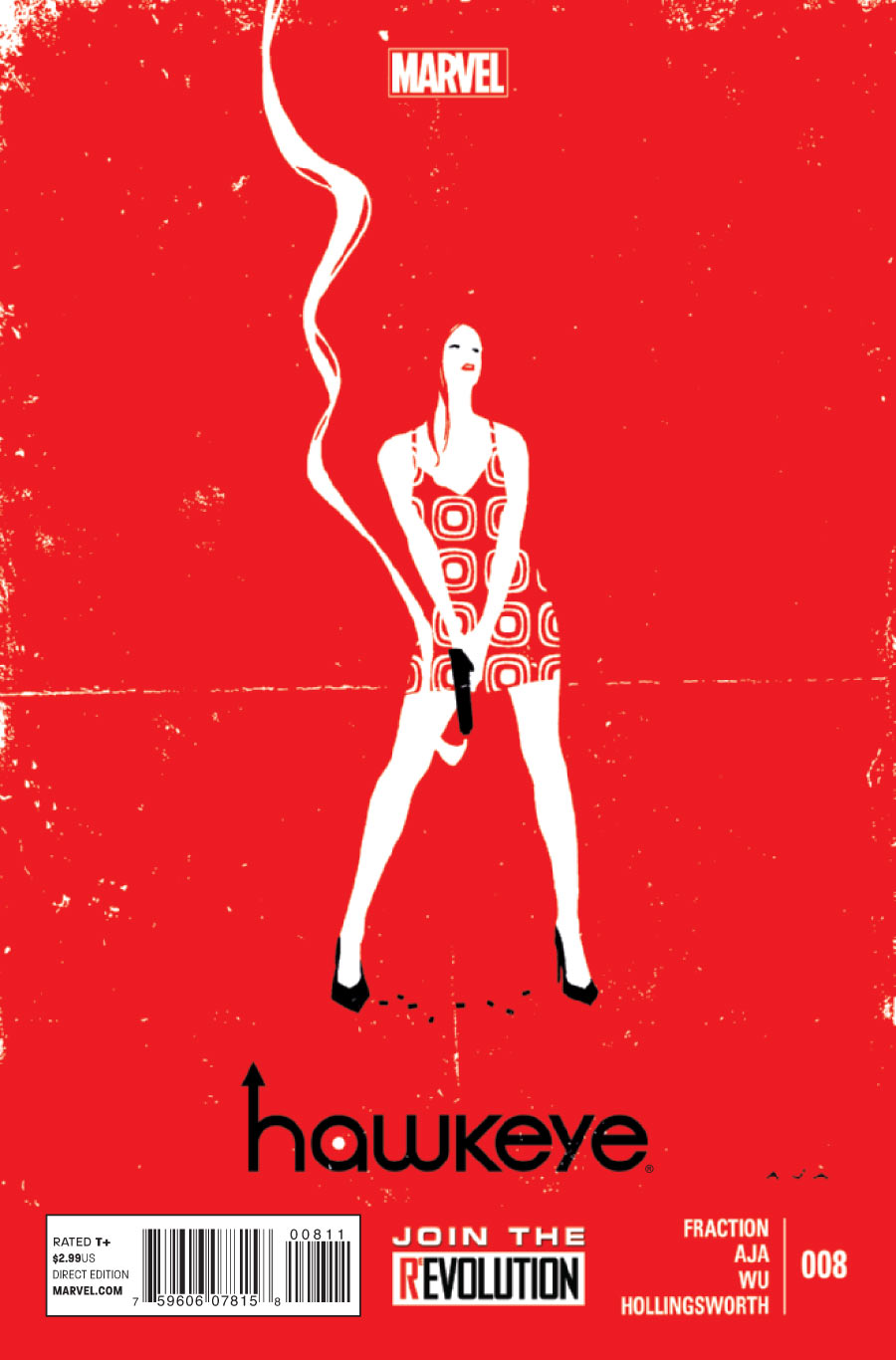
David Aja’s style is defined by graphic simplicity, but his covers take that approach to another level, delivering a clever distillation of this issue’s themes. It’s sexy, it’s violent, even the distressing of the cover reflects the vintage comics inside that turn out to be a major plot point. It’s an attractive, clever cover (it’s not lost on us that there are eight casings on the ground — corresponding to the issue number), perfectly symbolizing — and priming us for — the issue it precedes.
5. Trillium 1 — Jeff Lemire
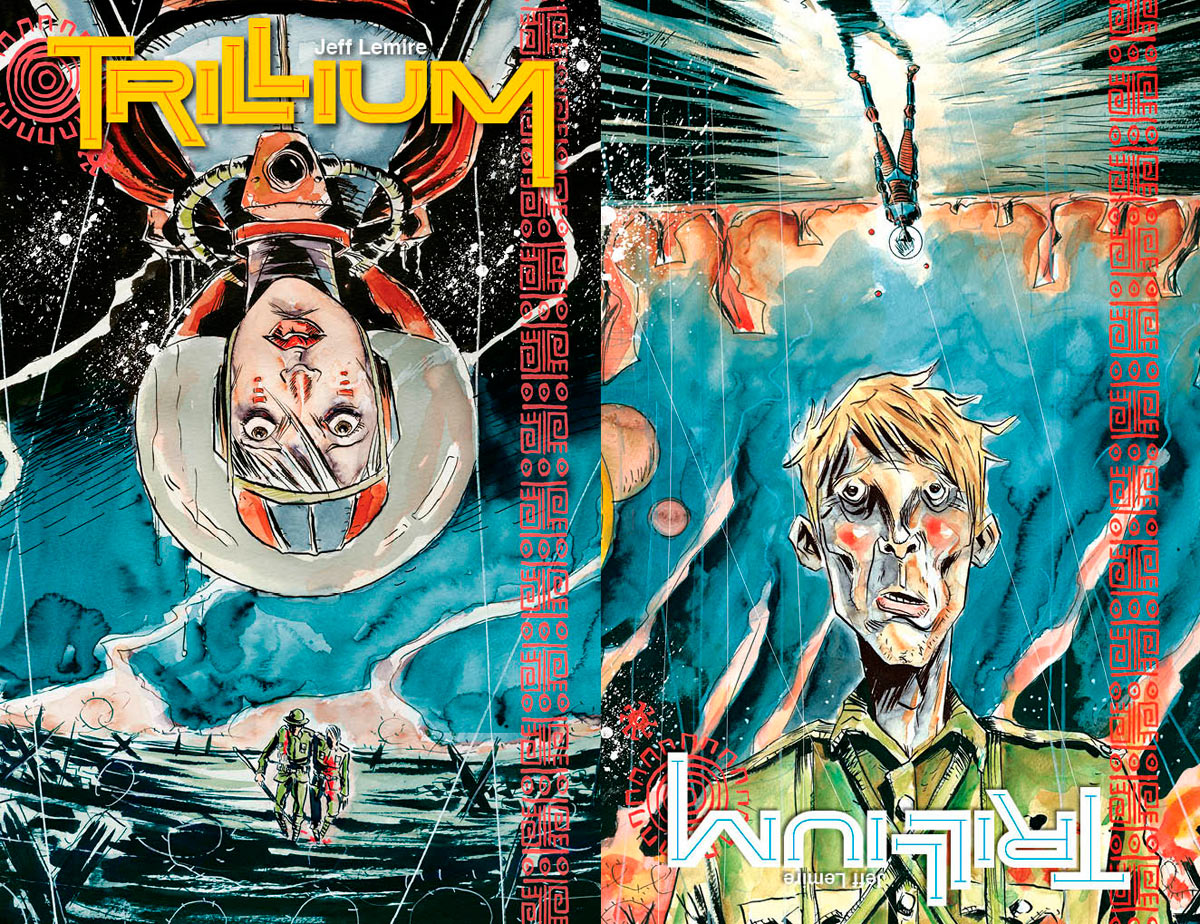 Jeff Lemire is using Trillium as his canvas for exploring the the physical medium of comic books, and nothing makes a bolder statement than giving the first issue two separate, simultaneous front covers. Whether you read Nika’s side or William’s side first, you’re teased with an image that refuses to accept any one reality as principal to the other.
4. Wonder Woman 26 — Cliff Chiang
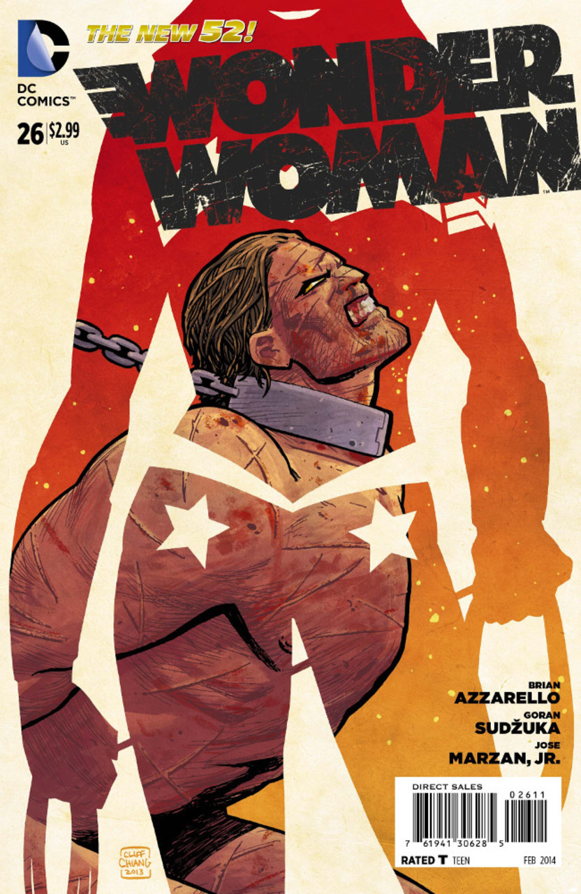
Cliff Chiang’s cover for the most recent Wonder Woman is stunning — it’s easily the most designy cover we’ve seen for this series. But it also manages to convey the similarity between the strengths of Wonder Woman and the First Born. Where they differ is in their pointedly temporary relationship with bondage — the First Born is chained around his neck, and profoundly unfree. Wonder Woman, meanwhile, holds her magic lasso in both hands. It’s a powerful image, if not totally reflective of what’s happening in the issue (she’s not keeping First Born, Apollo is), but the chain crossing her right arm and the parallel between the neck brace and Wonder Woman’s (largely obscured) choker might also suggest that Diana’s not a free as she thinks.
3. Batgirl 18 — Mikel Janin
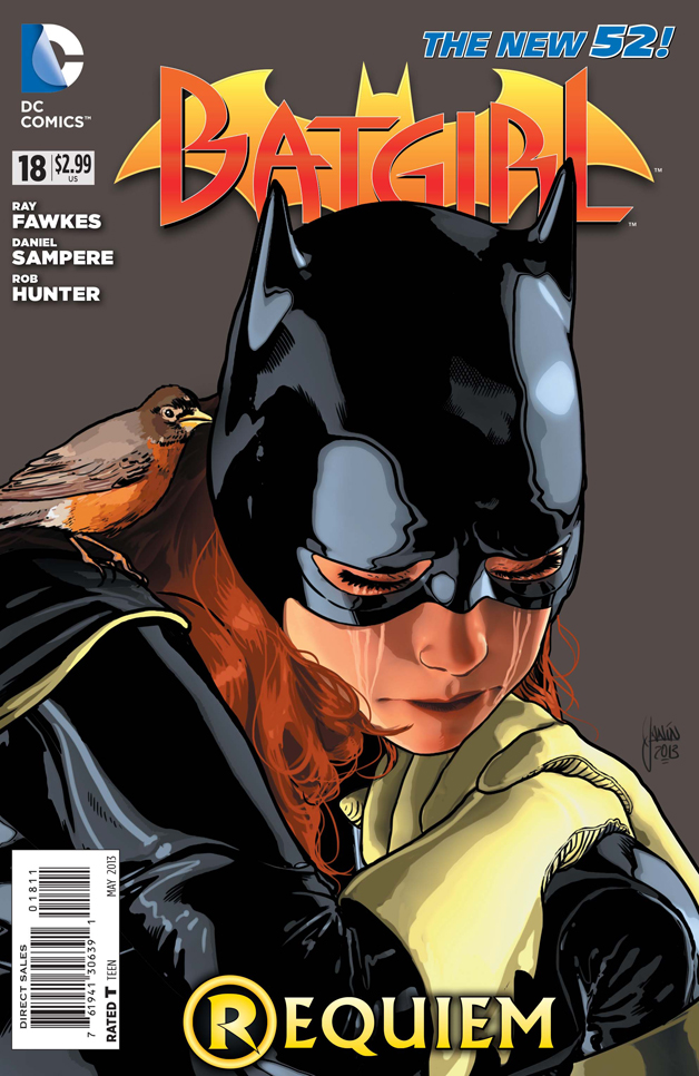
There were a handful of issues that suddenly popped up with these surprise-sad covers, and most of them used that maybe-too-on-the-nose robin as a symbol for…well: Robin. Mikel Janin keeps this drawing incredibly simple by reigning in the extremity of Babs’ emotions. She’s clearly devestated, but she’s just taking a minute to process the loss. We’re so close to Barbara that every detail needs to be rendered in loving detail: the grip on her gloves, the way hair falls around her face, even the slight red ring around her closed eyes. The issue itself refused to acknowledge the emotional reality of Damian dying (Batgirl had other things to worry about), but after this cover, what more do you need?
2. Hawkeye 9 — David Aja
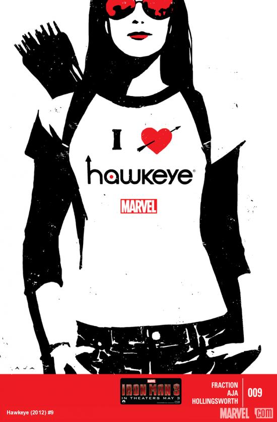
If any cover this year displayed how well a series understood its relationship with its own fans, it’s Hawkeye 9. David Aja co-opts the iconic “I [heart] NY” t-shirt and adds all the best graphic flourishes: an arrow through the heart, and a more different arrow pointing up from the H in Hawkeye. Thousands of fans said in unison “I want that shirt.” Putting Kate Bishop in the shirt just furthers our love affair with the character. Plus, Kate just looks so fucking cool in high contrast.
1. The Flash 22 — Francis Manapul and Brian Buccellato
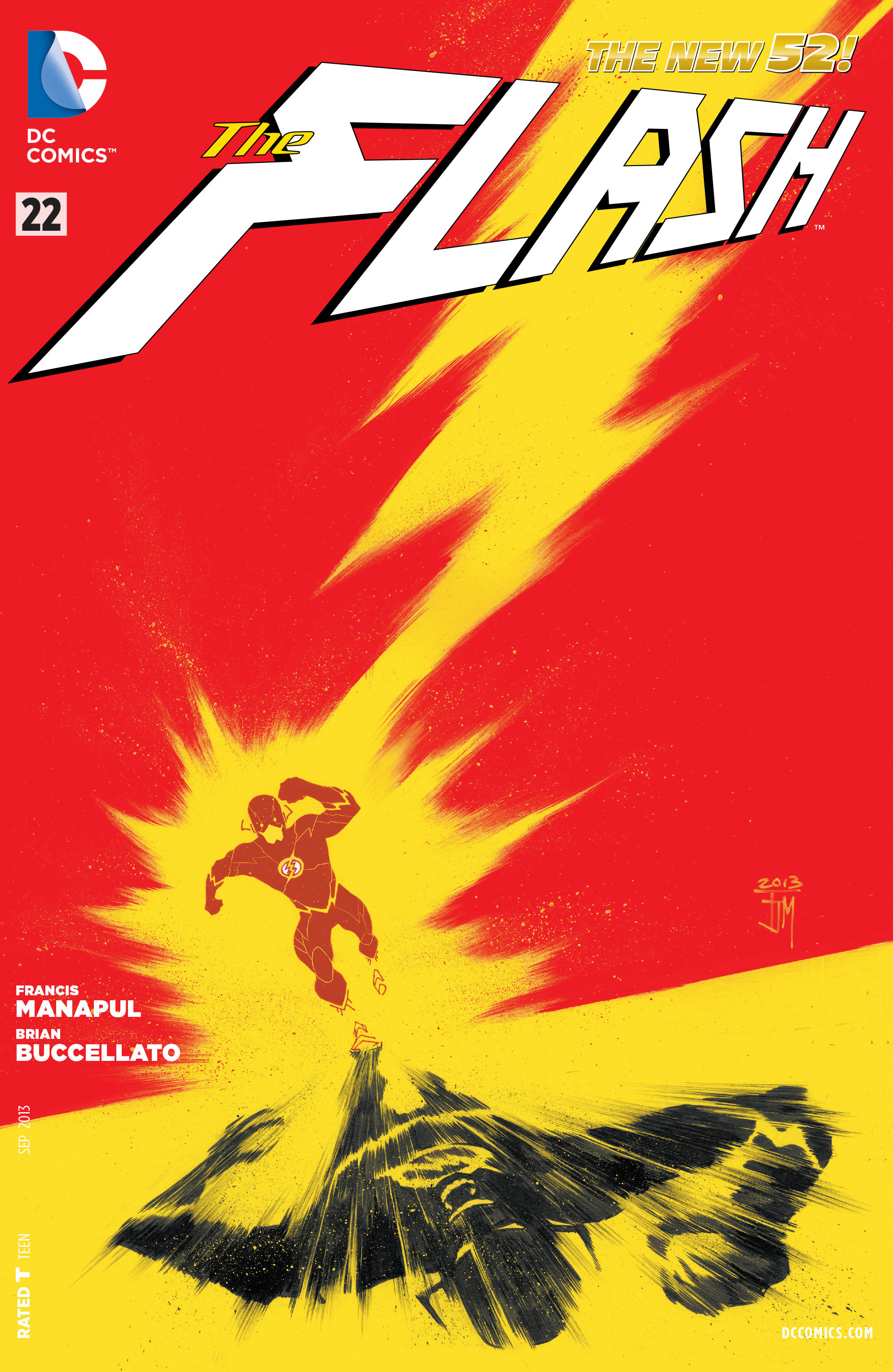
The best covers distil the mood of the issue into a single image, but a few manage to do so for an entire series. Clever, graphic, and emotionally charged, this cover is a perfect match not only for the issue it precedes, but for The Flash as a whole. It helps that the cover art team — Francis Manapul and Brian Buccellato — are also the series writers, but the simple clarity of this cover stands in stark contrast to the dense subtext that has defined their run.
Want more Best of 2013 lists? Check out our Best Issues, Best Twitter Personalities, Best Artists, and Best Writers lists!

Wow, there were some really nice looking covers out this year that I didn’t even notice/remember.
Here’s the list I compiled, again, totally spur-of-the-moment and based more on the books I was myself reading (so not as inclusive as the above list), but I definitely think our official list is better:
The Flash 22
Hawkeye 8
Young Avengers 13
Superman/Wonder Woman 1 (wrap around cover)
Justice League 22/Justice League of America 6/Justice League Dark 22 (three-in-one cover; I know this is cheating I don’t care, it’s all one picture)
Deadpool 18
Young Avengers 8
Hawkeye 9
Green Arrow 23
Young Avengers 4
Hawkeye 11
FF 4
Avengers 11
Runners up: Deadpool 13, Fearless Defenders 5, FF 6, Batman 18, Batman and Robin 17, Batman/Superman 3, Justice League 24, Batman Inc. 8, Saga 13, Superior Foes of Spider-Man 3, Thunderbolts 17, Uncanny X-Men 10
So, I didn’t notice it at the time, but the cover for FF 8 is actually a MAD Magazine-style fold-in. It immediately turned a ho-hum cover into one of my top picks (but not enough to make the cut when everyone’s votes were tallied).
Yeah, I had noticed that one too, but it’s not the flashiest application of the MAD fold-in style. It’s possible that I have a romanticized vision of them in my mind, but the cover to FF8 was actually pretty simple.
Great selection, but not a single Batwoman issue or any of Villains Month issues? Or Image books like Saga, Nowhere Men, or 68?
I had Batwoman 17 (Kate walking through flames) and Saga 13 (Hiest holding Hazel) on my personal list, but I guess I didn’t rank them high enough to make it on to our combined list.
Honestly, most of the Villains month covers were very samey – even down to having the same drawing of the bound hero in the background of several of them. I guess the two that I remember being stand-outs are Two-Face (which probably had the best use of the 3D cover) and Parasite (but that’s mostly because I love Kuder). Which Villains issues would you have on your list?
I also liked the Parasite cover. Additionally Court of Owls, Mr. Freeze, Count Vertigo, Grodd, Bane, Reverse Flash, and Arcane all appealed to me. You have a point about many of them feeling like identical, a bit like templates shoddily filled in.
In general, I’m so sick of major label comics, particularly DC, being covered in ads and text. Independent covers look so much better these days because the entire covers are art instead of ads for the Arrow TV show. Seriously, does DC think that comics readers don’t know there’s a tv show about the Green Arrow? It’s such preaching to the choir at the expense of the cover.
Anyway, nice list, nice blog!
You guys must be touched. One title wins almost every month, X-men Legacy.
Not every cover can live up to you obsession with pills, Paul.
Seriously, though, I really like that cover for issue 6.
Also my obsession with board game… wait I do have that actually.
Or even Russian nesting Dolls.
Well, shoot. Maybe I need to give this series another shot, huh?
What you need to check out is Number Cruncher. It is fantastic. Also by him. I will be getting more of those in stock. I think it is right up your ally.
It’s not an easy read, it features a ton of other X-Men, some pretty obscure, but has been a great story. With fantastic covers…
nice list. A number of the prophet covers are super great too
I’m late. These are going to be in some order, but not sure what kind.
King Conan 1: The Hour of the Dragon. Conan dressed in flowing furs, atop a peak with a two handed sword raised to the sky with rolling clouds behind him and the echo of a mummy in the clouds. This cover got me back buying Conan comics.
Avengers 1,2,3: I’m a sucker for connected covers and this one rocks. Shows all 185 Avengers (that’s how many are on the roster now, right?) and. . . I have nothing else. It’s cool.
Ultimate Spider-Man 27: Miles flying through the air towards Roxxon as the sun set behinds him with the reflection of his attack showing off the building. Brilliantly colored and shows just how small he is compared to what he’s going up against. Of course, his next foe is Galactus…
Superior Foes of Spider-Man 7 and Amazing Spider-Man 700.5: Both by In-Hyuk Lee. I don’t know what these are, but they’re hyper realistic and look freaking gorgeous. They look like photographs. I want to put on tights and have In-Hyuk Lee draw or paint or whatever it is he does to me and put me on a cover.
Saga 9: A romance cover with a shirtless hunk being felt up by a hot spider creature with way too many arms and eyes.
Hawkeye 13 and 14: More connecting covers. This would look good in a gallery. I love the style.
All Star Western 19: These fold outs were pretty well executed by DC. Jonah Hex should always team up with someone. Like here, with Booster Gold.
Batwoman (all year): These were amazing.
X-Men Legacy (all year): These were amazing.
Astro City 2 and 3: Another connecting cover! Makes me want to know more about ALL of these guys.
I found a bunch more that I liked, but this is a fine list.