 Today, Drew and guest writer Michael are discussing She-Hulk 5, originally released June 11th, 2014.
The film went from a Japanese Saturday matinee horror flick to more of a Hitchcock, the less-you-see-the-more-you-get thriller.
Stephen Spielberg on Jaws

Drew: I don’t care about authorial intent. It seems totally logical to me — I can’t presume to know what an author’s intent was, so I don’t know why I would bother caring about it — but I often find myself confronted by people who don’t see it that way. The author clearly didn’t intend that, so why am I talking about it? In those instances, I like to point them to the production of Jaws — specifically, the way the malfunctioning Shark puppet affected Spielberg’s choices. His intent was to show the shark a bunch, but circumstances forced him to reserve those shots for key moments, relying more on suspense than jump-out-of-your-seat moments. It makes for a compelling viewing experience, but one that’s virtually unrelated to anyone’s intent. That is, an analysis focusing on the authorial intent of Jaws would dismiss a key element of the final product as if it were a flubbed line, or a member of the crew in frame, some unaccounted-for artifact of the filming process. It would be easy to similarly dismiss a guest artist as a similar artifact of comic books, a decision borne more out of necessity than of creative mojo, but that would ignore the effect those changes have on the reading experience, which — as is the case in She-Hulk 5 — can be quite profound.
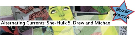
That is to say, Javier Pulido’s distinctive art has been a key element of this series’ identity, which makes Ron Wimberly’s equally distinctive — but very different — art a noticeable change of that identity. As with Jaws, it may be a decision borne out of practical concerns, but the effect is actually quite stunning. Take Wimberly’s opening page:
 It’s not quite a fisheye effect, but it’s definitely a unique perspective — above Herman’s shoulder but extremely closeup, maybe pulling together angles looking both down at the floor and across the hall in a kind of vertical panorama. It immediately puts us off-kilter, making us acutely aware of how different the art is from Pulido. Indeed, this kind of gut-wrenching two-point perspective seems totally out of Pulido’s wheelhouse, giving this issue a distinctly different feel from the rest of the series.
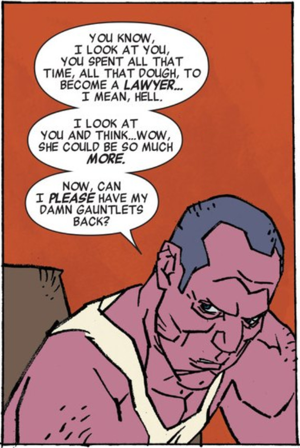
And indeed, this issue is quite a bit different from those that came before, following Jen, Angie, and Patsy as they each follow up on different leads in regards to Jen’s mysterious Blue File — a case filed in North Dakota naming her and several other superheroes and villains as defendants, but that she has no memory of. Jen checks in with Herman Shultz, aka The Shocker, another defendant, using decidedly non-punch-y methods to get him to talk. The strange thing is, he doesn’t seem to remember, either, though he eventually comes up with something vague about good guys trying to stop something.
Meanwhile, Angie is following up on the actual court documents — seemingly the most logical route to answers, if not for the fact that they were never digitized, and only exist in a disorganized, unheated storage space in North Dakota. As Angie notes, “this is why God made paralegals,” and she actually makes pretty quick work of finding the file…only to have the kindly North Dakotan secretary pull a gun on her and fire.
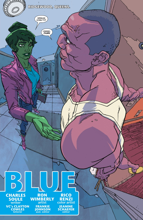
Patsy meets similarly violent resistance when she mentions the cate to Tigra, another defendant. Tigra goes nuts, attacking Patsy and attempting to take her own life. That scene is set on a bamboo scaffold, which offers Wimberly an opportunity for more of that crazy two-point perspective where one of those points is down.
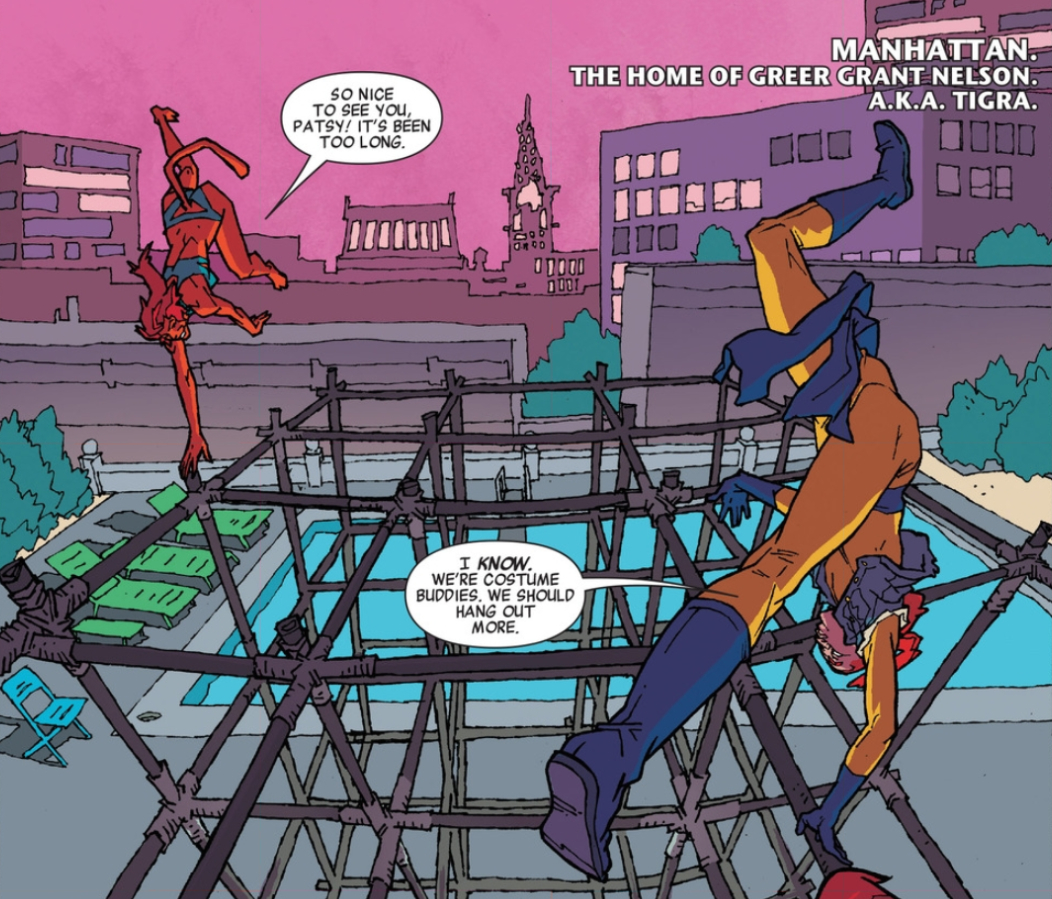 It quite literally flips our expectations on their side, rotating the traditional two-point perspective 90º, foreshadowing Tigra’s utter change in demeanor upon hearing the mere mention of the case. Patsy desperately calls Jen, both for help and to warn her about the effect telling people about the case seems to have, but the line is busy: Jen is about to ask Wyatt Wingfoot, another defendant — who is currently responsible for the lives of several rock climbers — about the case.
Charles Soule has created a great deal of intrigue with this secret case that seemingly drives people insane, but for me, the real joy of this issue is Wimberly’s idiosyncratic camera placements. He’ll angle shots up or down to create an extra vanishing point, he’ll bring the subject in tight to create unusual proximity effects, he even shoots between Hellcat’s legs to get a shot at her face as she’s doubled-over in pain.
 All of that attention to perspective in the art cues us into the perspectives in the story — especially how clueless Jen, Angie, and Patsy are when it comes to exactly what it is they’re dealing with. Whatever is going on with this case, it’s something big, and I can’t wait until we have the perspective to appreciate exactly what it is.
With that, I’d like to introduce our guest writer, Michael Bround. Michael curates the very intelligent Atoll Comics, which features some of the best, most approachable comics analysis out there (seriously, fans of Retcon Punch would love Atoll). Michael! I can’t wait to hear your thoughts on this issue. I focused so much on the art that I neglected to say much about the characterization of our three protagonists (plus Hei Hei), but I think Soule and Wimberly do a fantastic job of giving each of them a unique voice. What stuck out to you about this issue?
 Michael: Hi, thanks for having me. Drew, I think you really hit the crux of She-Hulk 5: replacing Javier Pulido and Munsta Vicente on art duties with Ron Wimberly and Rico Renzi has created a massive change in the voice of the comic. It is such an abrupt departure that I can’t help but focus on it too, because it’s left me deeply conflicted about the issue.
 Judged in isolation I think She-Hulk 5 is a pretty good comic. It advances the ongoing plot of the series nicely, bringing in what I hope will be a more substantial story about the mysterious Blue File. I love how the threat of the Blue File is unfolded in this thematically appropriate fact finding way. Rather than an epic superhero brawl, this issue sees She-Hulk have a friendly interview with thuggish Shocker, Hellcat investigate co-defendant Tigra, and Angie the paralegal travel to North Dakota to do all the hard work (as paralegals do). It is definitely a case of the lawyering leading the Superheroics, which remains one of my favourite aspects of She-Hulk. The story builds nicely, uncovers key facts, and ends on a dramatic smoking gun and a literal cliffhanger. It’s a satisfying episode of comics.
Keeping the lens purely on She-Hulk 5, the art is also pretty great. Wimberly and Renzi are great storytellers and really enhance certain aspects of the story. Wimberly is a magician at using unorthodox perspectives which, when coupled to his exaggerated anatomy and Renzi’s dynamic shadows, add a lot of tension and drama to every panel. As you pointed out Drew, this totally enhances the themes of mystery and lurking danger in the issue and makes She-Hulk 5 feel more like a slow burning thriller than a light, fun law procedural. I also love Wimberly’s character designs. His solid, faintly butch She-Hulk, lumpy Shocker, and angular, vaguely inhuman Tigra convey so much of character in just their faces. I can’t fault She-Hulk 5’s art team for my misgivings about the issue, they did a great job.
 The thing about episodic fiction, however, is that individual instalments beg to be compared to their series. By that metric I have issues with the art change: Wimberly/Renzi She-Hulk is not the same book as Pulido/Vicente She-Hulk. Drew, I actually have a problem with your Jaws analogy. Changing artists is not really a director being forced to modify his approach by technical limitations, but more completely switching directors between films. Less Spielberg in Jaws, more swapping out Spielberg for Jaws II. Pulido and Vicente are integral to the authorial tone of She-Hulk because they are part of the collaborative authorial borganism. Their pop art inspired approach to storytelling, reliance on highly engineered layouts, and bright flat colouring are as much a cornerstone of She-Hulk as the writing of Charles Soule is. To take that art away and replace it with Wimberly and Renzi who, while great artists, have a completely different mode of storytelling, just fails to deliver a consistent She-Hulk comic experience.
And it’s not just the series aesthetic that is lost with the change in art direction. Drew, while you rightly point out that Wimberly/Renzi nail the tenser moments in the comic, I feel like they fail to deliver, or deliver as well as Pulido/Vicente would have, on a number of lighter moments. Sequences like She-Hulk chatting with Shocker or Helcat playing on the cat-person obstacle course with Tigra I suspect should feel light and fun, but Wimberly/Renzi manage to make these sequences feel dangerous and intense instead. Which seems like a miscue to me. (Also, Imagine how effective a plot turn Tigra snapping would have been if the preceding panels were less menacing?) The art driven sense of fun is as integral to the identity of She-Hulk as its law procedural core or its idiosyncratic look, and Wimberly/Renzi just don’t deliver on that which also fundamentally changes the comic.
 Basically, I get the feeling that the script for this issue would have done better with a more Pulido-esque pop art artist.
I think this speaks to the broader issue of comics logistics and devaluation of artists in mainstream comics. It is obvious that most artists can’t turn out the number of issues in a year that the mainstream comics publishers, particularly Marvel, want. This necessitates fill in artists or multiple art teams on most titles. And I think its really up to editorial to ensure that when hand-offs happen simpatico styles are in place. Otherwise, you get issues like She-Hulk 5, which are internally well done, but just don’t fit into the aesthetics and tone of the broader series.
Michael Bround is a Science Grad Student who irresponsibly blogs about comics at Atollcomics.blogspot.com. He is interested in how good comics work their magic and writes in depth analysis covering topics like layout, colouring, and plot structure in his favourite comics. He also offers suggestions on comics and books you might want to read. On resumes he describes himself as detail oriented, a problem solver, and possessed of a full head of gorgeous hair. One of these is a lie.
For a complete list of what we’re reading, head on over to our Pull List page. Whenever possible, buy your comics from your local mom and pop comic bookstore. If you want to rock digital copies, head on over to Comixology and download issues there. There’s no need to pirate, right?

I didn’t anticipate getting quite this mileage out of that Jaws analogy, but how we agree/disagree on that speaks to an interesting question: who is the auteur of a franchised comic series? Looking at it from a film perspective, one could argue that the artist is the auteur, effectively serving as the “director” of the issue/series at large. BUT, as Michael points out, the serialized nature of comics is an important consideration, which may make TV a more accurate model, in which case the director isn’t as important to the final product as the “running” of the series — that is, continuity and aesthetic considerations. Depending on the perspective (or the creators involved) that could be the writer(s), but it’s also arguably the series editors.
I should clarify: I think Michael’s “borganism” explanation fits (most) creator-owned series perfectly — it’s ultimately a collaborative medium, and trying to parse who created what seems like an utterly unrewarding prospect. However, I think the equation changes a bit when the characters are neither the writer’s nor the artist’s, but are instead curated by a team of editors. They are the show-runners in the TV analogy, with both writers and artists essentially being “for hire.” It’s easier to see that model in older assembly-line comics — and it’s arguable that we’re currently in a state of transition towards focusing more on the talent involved — but I think it’s still closer to the truth than many of us would like to admit.
Where does that leave us? Does it actually matter who the auteur is? Aside from giving us a name to praise or pan (or to seek out the other works of), I’m not sure it really matters. An individual issue either works or doesn’t, and those issues either hold together into a coherent series or they don’t, and how we evaluate that largely subjective.
Okay, I don’t know where I’m going with this. What do people think? Who do you consider the auteur of a comic series? I can think of prime examples supporting each, so the write answer may be “all of the above,” but it’s interesting to think about (or I think so, anyway).
I just wanted to chime in that I started reading Retcon Punch’s Marvel reviews a few months ago (Marvel NOW! broadened me from an X-Men reader to a Marvel reader; well done, Marvel). And these analyses have been so very on point.
It’s hard to argue with Michael that the humor was perhaps lessoned by such a dramatic change in art, but I found myself enjoying it far too much to let it bother me. Overall, I adored the issue.
That’s actually brings up a really interesting point: how much does consistency matter? I definitely agree with Michael’s point that a series is more than the sum of its constituent issues, but how much do we value that consistency? Is it inherently bad that we don’t get what we signed up for if we enjoy what we do get, anyway? Some series, like Ales Kot’s Zero make that inconsistency an important part of the aesthetic — effectively making the regularity of the artistic changes a constant — but does that mean the default aesthetic is “no artistic changes”? There’s obviously no “right” answer to this, but I’m curious about folks’ answers, because I bet they’re pretty different.
*lessened. Oy.
“Trust me, they’re all Thors,” is enough to recommend this comic.
I’m not huge on Pulido (although he’s now one of the artists I can identify on demand), but this was a grating shock to the optical system. I don’t mind this style – it’s just not what I was expecting. It felt like I was watching Ren and Stimpy or Beavis and Butthead.
It just wasn’t what I wanted.
And I had no way of knowing that until I saw that first image of purple Shocker in his underwear and his exaggerated features and strange angles. Actually, maybe it felt a little Kick Ass, too, with the lips in the mask. I don’t know why that made me think Kick Ass, but it did.
It was garish and grating. It was well done, the fight scene between Hellcat and Tigra was amazing, but it was SO far from what I expected. . . that’s what I get for having expectations! Go into each issue with an open mind. My mind was closed.
I liked the story. It’s funny and I want to know more. The art takes me to a place I wasn’t expecting.