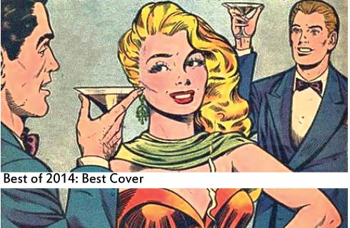
 You know you shouldn’t judge a book by its cover, but that doesn’t mean you can’t judge the cover on its own merit. Some covers are so excellent that they pack all the drama, excitement and emotion of the whole issue into one succinct image. Sometimes they end up being their own surreal experience. And other times, we’re just exciting to see our favorite heroes kicking ass one more time. These are our top 14 covers of 2014.
14. Ms. Marvel 7 — Jamie McKelvie & Matthew Wilson
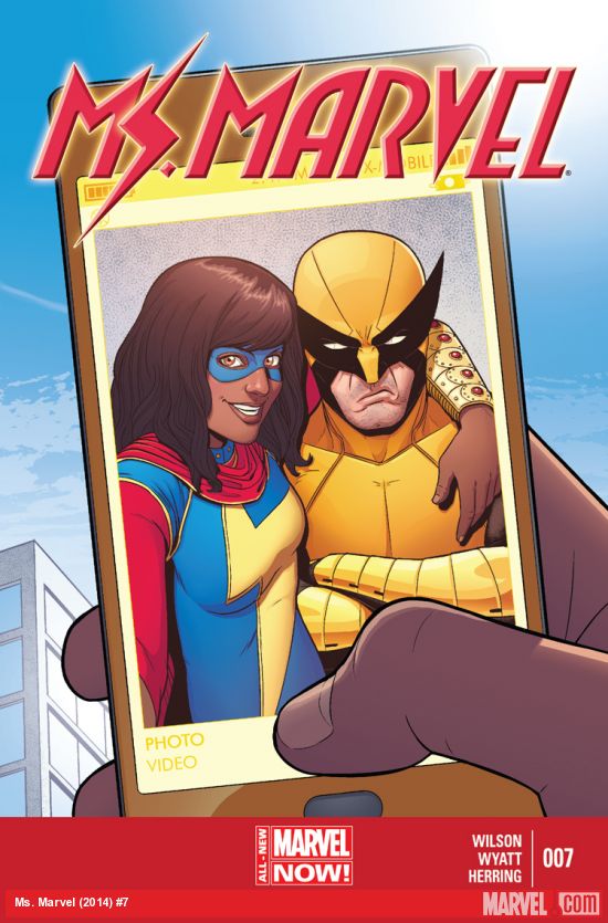 DC might have gone out of their way to do a whole month of selfie covers, but none of them made quite as much sense as this cover which occurred totally naturally, faithfully expressing the personalities of Marvel’s newest audience favorite and one of their oldest. Kamala’s whole identity is born out of her fandom, so it’s only natural that her first (and if “death” is to be believed, last) meeting with Wolverine would be at least 80% hero-worship. Jamie McKelvie is a natural fit for this sort of cover, having shown off his social media bona fides in his work with Kieron Gillen on titles like Young Avengers and The Wicked + The Divine. Ms. Marvel is a pop icon for the currnet generation — simultaneously fan and subject, and this cover is the perfect illustration of that.
13. Detective Comics 37 — Francis Manapul
 A hero faces off against a villain. Its as classic a cover scenario as it is a comic book story, but Francis Manapul finds new ground to break here, mining the thematic dichotomy between these two characters for all its worth. Moreover, it calls for him to use every extended technique he developed on The Flash, from ink spatters to digital coloring to his signature diegetic lettering. Throw in some primary colors, and you’ve got one hell of an iconic cover.
12. Black Widow 13 — Phil Noto
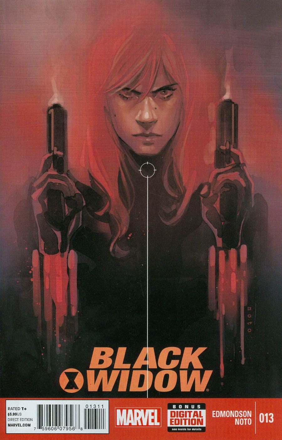 Phil Noto brings a unique visual vocabulary to Black Widow, a smokey sexiness that just barely masks something much more sinister. Here, Natasha’s signature red hair bleeds into the background, and it’s unclear if she’s somehow casting her own light or if that red comes from the glow of the guns, or even her techy gauntlets. It’s the perfect melding of spy and tool — a central theme of Edmondson’s white-knuckle series.
11. Wonder Woman 34 — Cliff Chiang
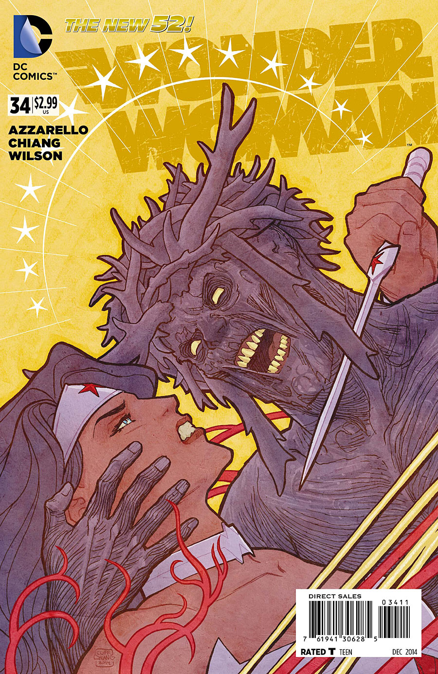 Cliff Chiang’s style has long been defined by its clean lines and dramatic staging, making his covers something truly special. Most striking about his covers are the color holds, which give them a graphic, painterly quality that evokes everything from classic movie posters to greek pottery. Series colorist Matthew Wilson started picking up on those color holds and applying them to the interior art, making the issue inside every bit as gorgeous as the cover.
10. The Sandman Overture 3 — J.H. Williams III
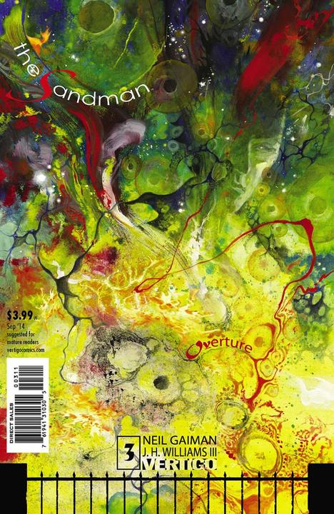 How do you craft an image as otherworldly and beautiful as Neil Gaiman’s mind? By throwing all of the rules of comic book covers out the window. I mean, sure, the title is technically in there (though “Overture” is separated by over half of the cover, and damn well camouflaged), and you can almost make out Morpheus’ face, but this cover is far more about swirling psychedelia than it is about any kind of representation. Er, at least physical representation — this thing actually perfectly evokes the alien nature of the issue, making the cover less abstract that it first seems.
9. Secret Avengers 10 — Tradd Moore & Matthew Wilson
 Ales Kot writes his Secret Avengers as a pack of nearly-sociopathic superspies with a deeply buried heart. Coulson’s PTSD — and semi-splintering from the group — has been one of the bigger hurdles the team has faced, and it’s up to poor, fragile Hawkeye to bring Coulson back into the fold. Tradd Moore, whose lanky figures give All-New Ghost Rider an otherworldly quality, illustrates the fragility of this interaction, and Matthew Wilson’s muted colors help evoke the series’ signature mix of bleak and goofy.
8. Hawkeye 17 — David Aja
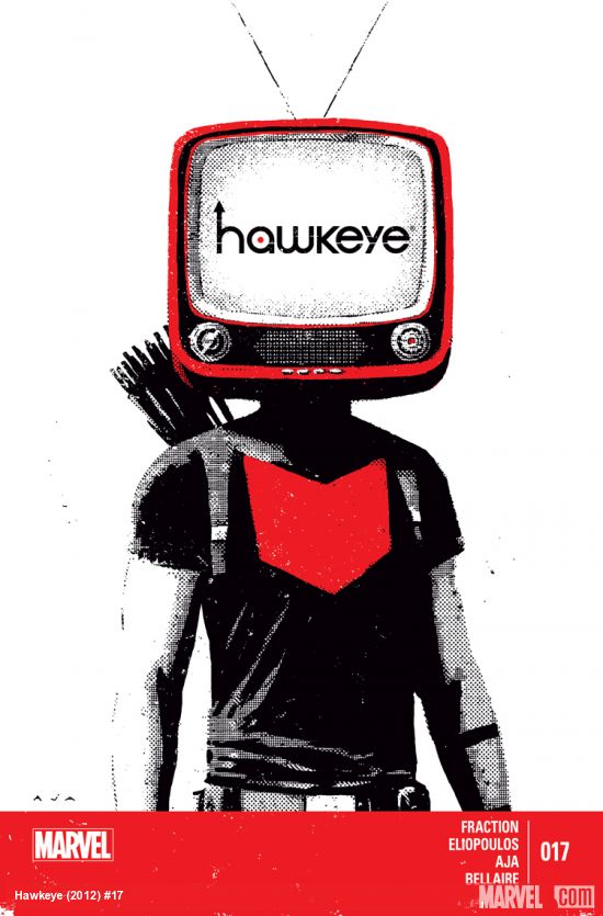 Even for a series known for its recursive issues and aesthetic detours, issue 17 of Hawkeye offered a strange, roundabout look at its central characters and themes through the guise of a children’s animated holiday special. It’s easy work to draw the parallels to our main cast, but the greater meaning is much more elusive. This incredibly evocative David Aja cover reinforces the idea that the TV contains an honest insight into the character’s head, and it doesn’t bother with subtlety. Plus, it’s as simple and graphic as Aja’s finest covers, embracing a new splash of color that is at once festive and menacing.
7. Wonder Woman 31 — Cliff Chiang
 The second of our favorite Wonder Woman covers this year distils Chiang’s line-smart style to its graphic essence. It’s deceptive in its simplicity, chiseling the series down to a few potent symbols — a human skeleton, our hero riddled with arrows, a barren tree. That tree is really the lynchpin of this issue, as its not clear if the leaves have dropped as a sign of death or of eventual rebirth — a prospect made all the more complicated by the way the skeletal face recalls the vein motif distinguishes the First Born, and by the fact that Diana is bound to the tree with her own lasso of truth. Potent symbols indeed.
6. Catwoman 36 — Jae Lee & June Chung
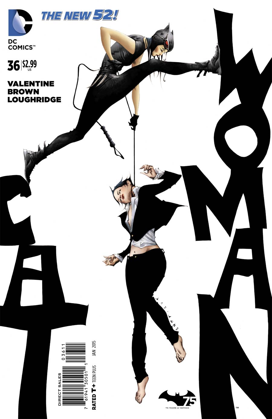
The Catwoman/Selina Kyle duality has been pushed to the fore since Genevieve Valentine and Garry Brown took the series over a few months ago. Jae Lee’s cover for issue 36 lays the conflict between old and new versions of the character bare, showcasing the mob boss and her alter ego literally fighting between the words “Cat” and “Woman.” Lee’s art always has an affect of sophistication, heralding an elgeant new direction for both the series and the character.
5. Detective Comics 30 — Francis Manapul
 Francis Manapul and Brian Buccellato’s collaborations have been all about making their subtext text, so it only follows that their rich, nested symbolism should be so explicitly articulated on the cover of their first issue of Detective Comics. Manapul takes extra care to make the symbology explicit, alternating silhouettes with more detailed figures, raising the question of whether these figures are superimposed or cutout of one another, and what either option might mean.
4. The Sandman Overture 2 — J.H. Williams III
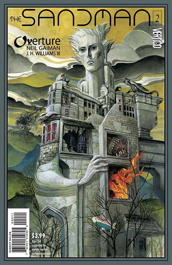 The cover to issue 3 may have featured more psychedelic colors, but this one is decidedly trippier, turning to the series’ own nightmarish imagery for inspiration. That the kingdom of Dream is full of dark secrets is a necessary assumption of this series, but this cover (and the issue itself) suggest that those secrets may have lasting repercussions for Daniel — especially when you consider that Dream is made of his kingdom. That runs the risk of being too on-the-nose, but J.H. Williams III crafts a striking cover that transcends its symbolism, as iconic and memorable as the surrealist paintings that clearly inspired it.
3. Wonder Woman 35 — Cliff Chiang
 Everything we’ve already mentioned about Chiang’s Wonder Woman covers is on full display here, from the dynamic staging to the potent symbolism, but what’s truly striking about this cover — for the issue that concluded Chiang and Brian Azzarello’s epic three-year run — is how inspiring it is. The “protagonist posing heroically while the rest of the cast looks on adoringly” schematic is nothing new (Joe Quinones provided a similar cover for the conclusion of Captain Marvel Vol. 7), but what’s truly inspiring about this cover isn’t Diana pointing the way to a new future; it’s the size and quality of the female cast behind her. Few series can boast a cast this well-developed, and fewer still can boast even a fraction as many female characters with distinct personalities and motives. That all of those come through in their posing and costuming (all reddened to reflect their fearless leader) speaks to Chiang’s strength, both as a character designer and as a storyteller.
2. She-Hulk 2 — Kevin Wada
 It can be difficult to boil an issue down to a single image — especially one as multifaceted as She-Hulk 2, which finds Jen doing everything from administrative tasks to dancing to fighting — so Kevin Wada just went ahead and included seven. Any one of these would make a fine cover, but its when they’re taken together in sequence — tapping into comics narrative capabilities — that they truly come alive, telling the story of a day in the life of Jennifer Walters that’s every bit as charming as the one in the actual issue. That Wada’s painterly style is such a pleasure to look at is just icing on the cake, but who ever said icing wasn’t important?
1. Teenage Mutant Ninja Turtles 30 — Sophie Campbell
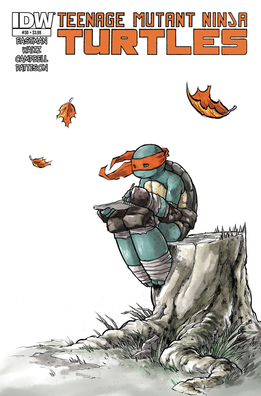 IDW’s current volume of Teenage Mutant Ninja Turtles has distinguished itself in many ways, from its clever reshuffling of Turtles mythology to its incredibly dynamic action sequences, but we’ve been particularly struck by the way it has emphasized the “teenage” portion of the title. This year’s “Northampton” arc in particular focused on the alienation of turtles (and a few select friends), exposing the massive heart that this series sometimes hides under sci-fi flash or ninja mysticism. Sophie Campbell was instrumental in making that arc so effective, softening and rounding the characters to remind us just how young they really are. This cover captures all of that and more, evoking feelings of isolation and wistfulness with just a solitary figure and a few falling leaves.
Want more Best of 2014 lists? Check out our Best Colorist list!

I went through my “modern” boxes, so anything that I’ve stopped collecting or ended in 2014 may not be included in here. I’m not hugely affected by covers, so this is always a tough one for me. In no particular order (and I have no idea how to show the comics or get a link in comments, so here goes):
The Fade Out #2: Painted noir at its best. I’ll try here and then maybe just put links later if it doesn’t work.
Oh, this did work. Maybe I should have done it for the rest.
Oh well. Others I liked.
Black Science #1. Frog God statue in the back, weird space suits and electric tongued frog acolytes. What’s not to love?
Thor #3: First of all, the new THOR logo with the hammer being part of the H and the whole O is awesome. The ice shattering with the new Goddess of Thunder breaking out is a tremendous image.
Saga #18: Bloody mouthed Lying Cat. Glowing eyes. What is the story behind that collar? Loved this cover.
Red Sonja #8, Frisson cover: Red Sonja looming out of the undrawn water with a dagger in her teeth with her hair pooling around her. So many things to like about this cover. I got it signed by Frisson at a con and might be my favorite cover of the year.
Rat Queens #8 wrap around cover: It sort of reminds me of Keep on the Borderlands. You’ll get me with a cover that has the protagonists in front marching across the terrain while being able to see the long road ahead of them and behind them. As much as I liked this cover (and this comic), I’m really interested in the implications that because you get arrested or are a major dick to your wife means you can’t draw a comic book any more. I am unsure about our social reactions to crime any more and our mindset on what your employment status should be if you do some things wrong. If I get a DUI, should I not be allowed to ink Sonic the Hedgehog? A really good and different comic that suffered from delays in the art and now seems to have completely fallen off everyone’s radar.
Manifest Destiny #11: I honestly believe Manifest Destiny had the best covers this year. All year. Nearly every cover is great. #11 features Lewis plunging from the top of the ship down into. . . something with the flag and the countryside behind him, swallowing him up. I’m not certain if any cover more accurately shows the theme of the past year of a comic as well as this one – in spite of the rage and fight and enthusiasm the men display, they’re so small and tiny and insignificant compared to the flag that is paying them, which is so small and tiny and insignificant to the wild they are exploring. Outstanding.
Honorable mention:
Superior Spider-Man #32 and Amazing Spider-Man #11 variants connected baby spider-man cover. Baby Spider-Verse! Fantastic!
This is definitely the hardest category to even file down to a shortlist for me. Not necessarily because I have so many favorites, just because there are SO MANY COMICS every week. Between all of the ACs and the Round Up, we conservatively cover around 20 issues per week — thats over 1,000 comics a year. I have a pretty good memory for remembering issues — or at least remembering which series have issues that I might want to nominate for best writer, artist, etc. — but the only way for me to really do this list is to actually look at every single cover. I’m sure we overlooked some great ones.
For that reason I’m not surprised that our lists don’t overlap — Thor 3 was the only one you mentioned that made it on to our shortlist. There are just too many covers out there.
I’ll have to dig through my boxes when I got home, but I was equally happy with Cliff Chiang’s work this year. There were some great Mikel Janin JL Darks, a few John Romita Jr. Supermans, and Andrea Sorrentino Green Arrows that all stand out in my mind as iconic DC covers from the past year that I’ll want to pinpoint
My personal list overlaps a lot with yours, especially Thor and Saga. Especially especially Saga. To those I would add Wicked and the Divine 5, Lazarus 12, Rasputin 1, and Sex Criminals 6.
Just a few thoughts regarding Rat Queens: in my view it’s not that he committed a crime per se but that it was domestic violence. For a book that’s known and prides itself on being female-friendly and focused that’s pretty hypocritical. Also as far as I’m aware he’s shown no remorse or even fully acknowledged what he did, much less given any indication that he’s trying to change. Speaking for myself, I wouldn’t be able to continue enjoying the book given these circumstances if he was still drawing it.
I only read the first few issues of Rat Queens, and wasn’t even aware of this story about the artist, but I can say from my limited experience with the series that it seemed just as pro-violence as it was pro-women. It was cartoony violence, sure, but they’re cartoony women. In that case, it’s not that his actions are hypocritical, but that they’re not hypocritical enough, right? Or maybe reminding us that violence is real made us a little less comfortable with all of the fake violence he was drawing.
There’s a difference between violence against everyone as found in a fantasy story and violence that more frequently targets women in the real world.
The beauty of Rat Queens is that the women are exactly the same as the men, for good and for ill. They’re all violent, crass, caring, nurturing, and powerful, regardless of their gender, just like people in real life. That’s why the book is empowering, not because it features women being violent. To keep a man working on this book who clearly does not share that viewpoint would have been the peak of hypocrisy and a slap in the face to the fans. Wiebe made the right choice, and I am proud to continue to be a fan and support the title for that reason.
Right, but what’s offensive about domestic violence is the violence part, right? The point is that it gives physical power to someone, so whether or not there’s sexism strikes me as an entirely separate consideration. Like, I don’t think it would be better if he was battering his boyfriend rather than his girlfriend.
I’m not going to begrudge anyone being uncomfortable with this guy working on a book they read — I wouldn’t be comfortable with it, either — but I really don’t think it’s the gender dynamics that make this guy despicable.
My list is very specific to classically styled superhero books, and even more specifically to those published by DC, so by default it’s going to miss a lion’s share of everybody else’s faves, but this year I loved:
Multiversity 1 (Captain Carrot and Superman-23 on the same Ivan Reis cover!)
Justice League 30 (More Ivan Reis with Luthor headlining my fave New 52 JL line-up to date)
Batman 37 (Obligatory Capullo, and finally Joker looking like Joker for the first time since Detective Comics 1)
Superman 37 (JRJr Superman looking devestated as the plot derails leading into a new status quo)
Futures End 0 & 8 (Ryan Sook’s menacing dystopian DCU mash-up of Batman Beyond, Brother Eye, and Borg’d out Leaguers set the tone of everything leading into Convergence; #8 just looks like it would be an awesomely weird metal album cover)
Supergirl 37 Darwyn Cooke Variant (Torn with these Cooke covers in that I love his work in general but he seems averse to New 52 versions of the characters he’s depicting. Still, I can’t argue with Streaky The Super-Cat)
Wonder Woman 35 (It’s so haaaaaaaard… to say goodbyeeeeeeee… to yesterdayyyyyyy. Tour de force cover for the last issue of a run that I never wanted to end)
Most of my favorites made the final list (I was really pushing for both those Manapul/Buccellato ‘Tec covers and Secret Avengers 10), but I’m a bit bummed that my Number One choice, Deadpool 27, didn’t end up making the cut.
I probably spent more time poring over that cover than I did actually reading half the comics I bought this year.
Shout-out to the covers of Captain Marvel 4, Thor 1, Thor 3, Daredevil 1 and Ms. Marvel 6 as well.
That said, I can’t argue with anything on the final list up there. I’m pretty proud, all things considered.
I did love that She Hulk cover by Wada when it first came out. Was he the fill in artist as well? Because this cover so much better than the interior work on that arc that the main artist didn’t do. It was awful.