
Today, Drew and Patrick are discussing Lazarus 14, originally released February 18th, 2015.
![]()
…poetry is a short story missing 99 percent of the words.
Greg Rucka
Drew: I really wish I had the rest of the above quote, made by Rucka at the New York Comic Con in 2013, but to paraphrase, Rucka was suggesting that an intimate understanding of the form of short stories would prepare writers for every kind of writing except poetry. I’ve always seen a resemblance between Rucka’s taut comic work and great short stories, but what truly struck me about that quote was how it seemed to contradict the oft-quoted axiom that the required efficiency of short stories aligns them more closely with poetry than novels. This seeming contradiction may boil down to the inadequacy of our definition of “poetry”, but I couldn’t help but think of this quote as I read Lazarus 15, one of the most poetic comics I’ve ever read.
For me, poetry is about the elegance of form, from rhyming to meter to symbolism to the very concise nature that Rucka mentioned at NYCC. We may think of this as a limiting affect, but the purpose is to elicit an effect greater than the literal meaning of the words. As a visual art form, comics are inherently greater than the dialogue and narration they feature, but how the words and art interact is where the real magic happens. I’ve long been a lover of Rucka’s work with artist Michael Lark, and while I may have singled out the previous issue as exemplary of their collaborations, their work here is even better.
As an extended, largely wordless “trial by combat” between Forever and Sonja Bittner, this issue is a clear showcase for Lark. It’s a bravura fight sequence, to be sure, but before we get into just what makes it so fantastic, I want to focus on how Rucka sets him up for success. This isn’t to say that Rucka isn’t crucial to the success of the fight scene, or that Lark is any less crucial before and after it, but I do think the way Rucka prepares us for 13 copy-free pages is key for maintaining the integrity of the issue. Moreover, it’s executed so elegantly — so poetically — I really can’t help but pause to marvel at it.
For me, the skill here lies in ramping us into (and out of) the text-free passage — slowly cranking the textlessness of the pages to 100%. I struggled with ways to summarize and quantify this quality (can you tell I don’t typically analyze poetry?), but ended up producing this graph:
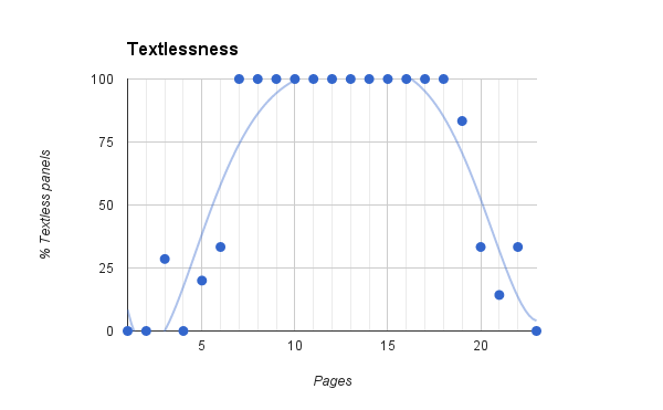
This is the number of text-free panels divided by the total number of panels, taken per page. Even leaving out the huge text-free middle section, it’s easy enough to draw a trendline showing a clear ramp up and down here. This series has always featured some fantastic copy-free panels — Lark’s bread and butter, really — but they seem to be used here in a decidedly more directed way, normalizing the textlessness even before page 7 hits.
Ultimately, that attempt at quantification falls woefully short, as the issue actually feels decidedly more text-free. No single page exemplifies this better than page 6, the last page to feature text before the fight begins.

It sounds silly, but I still have a hard time believing that over half of the panels here feature dialogue. Now, that certainly speaks to a failing of my quantification system — the wide-screen panels aren’t exactly text heavy, but count as texted panels, all the same — but I think it also reveals something about the simple amount of words Rucka is using here. Sonja says four words. Forever says three. Sonja says three. Forever says two. They’re effectively counting down to their own fight. Moreover, they’re steadily aqcuiesing their agency, using fewer words than Malcolm, Hock, and Morray, who collectively decided their fates.
(Actually, that counting down reaches its logical conclusion 13 pages later, when Sevara Bittner cries out to stop the fight. I think there’s an intriguing feminist message in here [especially given that Sevara and Bethany Carlyle are the only characters to utter fewer words than Forever and Sonja], but I want to stick with Rucka’s use of space for now.)
The lazari’s acquiescence of agency roughly tracks Rucka’s own acquiescence of power to Lark, turning over the keys to the story, trusting his art to carry the story for the next 13 pages. It’s reductive and perhaps ultimately wrong-headed to suggest that the amount of attention we pay to the art is inversely correlated to the number of words on the page, but I do think we evaluate dialogue-free panels differently than we do panels with dialogue. There are no words to set the tone and pace of the moment, which puts everything on the art, but Rucka’s clever way of acclimatizing us to textlessness tunes us in to picking up on those cues.
That Lark is more than up to the task is a subject for another 1000 words (and more), but unfortunately, I’ve used up mine counting panels. Patrick! I know you always relish the opportunity to discuss something other than plot points and character development when it comes to Lazarus (where those details can easily dominate the conversation), so I’m hoping you’ll answer this call to really dig in to what makes that fight worthy of all that build-up. Every choice Lark makes seems worthy of the same kind of detail-oriented essay, so in the interest of not burdening you with any one of those options, I’ll just suggest that this might be, if not the best fight scene we’ve ever discussed, certainly the most documentarian.
![]()
Patrick: It’s also the most impartial. One of the side effects of presenting the action so literally is that Lark betrays no personal bias for one character or the other. Forever isn’t the good guy and Sonja isn’t the bad guy — they’re just two women doing battle. If you look back at some of our earlier conversations about compelling action sequences, you’ll notice that those fights are sort of drawn with bias toward one party. Zero is resourceful and persistent, and goes to extreme lengths to win, so we feel he deserves the victory. Or how about that issue of Teenage Mutant Ninja Turtles we won’t stop bringing up? Beebop and Rocksteady look like monsters, and they’re framed like lumbering beasts. The morality of these fights is right on the surface. Lark goes out of his way to make this issue as symmetric as possible, projecting no additional cleverness or monstrousness on either combatant.
I won’t go into the same kind of panel breakdown that Drew did (sorry fellas, this is a one-graph piece), but it’s remarkable how evenly Forever and Sonja are represented on the page. That’s a logical choice for the trial itself — it is 13 pages of just two people fighting — but Lark’s insistence on this symmetry extends to well before the swords are unsheathed. The first time it hits extra-hard is page three:
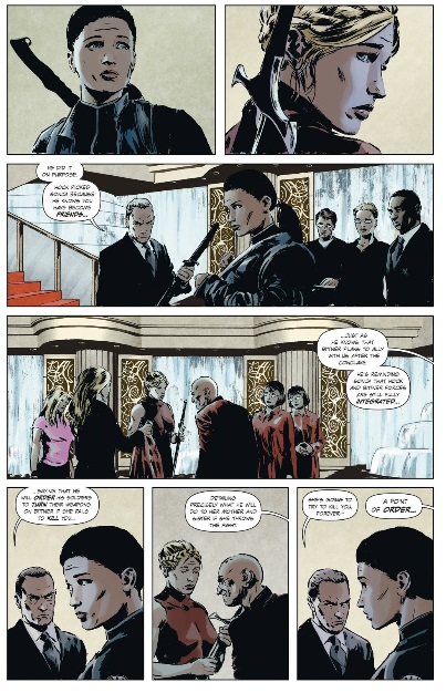
That first row of panels establishes horizontal symmetry in a pretty straightforward way: Forever on the left, Sonja on the right. Also, notice that while their faces take up a lot of real estate in those panels, their signature colors of blue and red (respectively) show through on that first line. Panels three and four are establish symmetry in the same way, by alternately focusing on Forever and the family she’s about to fight for and Sonja and the family she’s about to fight for, but the orientation is flipped 90 degrees. Those two panels in the middle of the page give us a vertical symmetry strong enough to override the fact that that final line has three panels instead of two. And speaking of those last three panels, they are their own form of symmetry, this time around a panel rather than the panel divider. LARK’S NOT DONE YET THOUGH. There’s also this amazing diagonal throughline from the bottom left corner to the top right that alternates Forever, Sonja, Forever, Sonja which is bookened by the characters looking over their shoulders at the other. You guys: we haven’t even started the fight yet!
The opening moments of the dual lean pretty hard on these same concepts of form and symmetry, and setting the whole thing in front of a ballroom staircase is a stroke of visual genius. Here, let’s get this page up here so we can talk about it.

The symmetry in the first panel is obvious, sharply highlighted by the symmetry of the stairs I just mentioned. The pacing here is also remarkably even-handed. Sonja attacks, Forever counters, Forever attacks, Sonja counters. By the bottom of the page Sonja and Forever has switched which side of the page they’re occupying. It’s much less literal than page three, but symmetry is established on multiple axes at once. While Lark does adhere pretty strictly to a shit-ton of formal symmetry, I think it’s important to point out that he does frequently take a non-literal approach mirror imaging. Check out that first panel (you know, the one where I described the symmetry as “obvious”) — the composition is incredibly clean and both combatants stand with swords raised, ready to strike, and yet they’re not absolutely identical. Sonja’s gate is a little wider and she holds the blade higher above her head. For as much as Lark has to present these characters as weapons wielded by warring families, he never lets the formal demands override the fact that Forever and Sonja are human beings. Those minor variations in stance or facial expression make this statement over and over again: the human cost of this ritual violence is huge.
I want to get to my favorite example of Lark’s hyper-symmetry in this issue. It comes late in the fight, on the page just before Forever lands her winning blow. It’s not the whole of the page, so just know that I’m isolating part of the page.

All of this symmetry is diagonal. The first and sixth panels both show full bodies at a medium distance, creating neat little bookends for this specific trading-of-blows. The second and third panels are focused on this sort of grappling moment, at a closer distance. They are also off-kilter both vertically and horitzontally, creating an axis of symmetry which intersects the previously established symmetry between panels one and six. Panels four and five do basically the same thing, only the camera is much closer, and while the action has moved from swords to hands, the focus has moved from bodies to faces. The totally amazing thing is that, even with all these individual occurrences of symmetry, there is one very clear story in these six panels — and it’s a one-way story: the story of Forever taking control of the fight. Look how simple it is. From start to finish, Forever’s actions in these panels are: reeling, blocking, deflecting, countering, disarming and finally striking back. It’s the whole narrative of on-the-ropes to on-top, punctuated by all the same formal cleverness that dominates the entire issue.
There’s one more panel on this page.
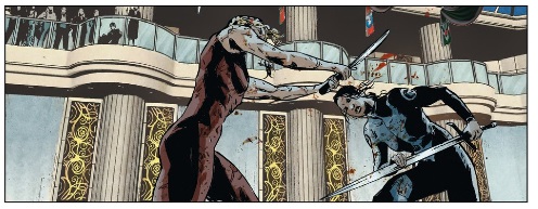
This last piece of action on the page puts a halt to our symmetry-a-palooza. In terms of the fight itself, it also gives Forever the opportunity to land a winning blow. Dropping this panel in at the bottom of the page is arresting, as though preparing the reader for something new on the next page, which we certainly get.
And after all that, none of the fighting (or symmetry!) matters. The day isn’t actually won for Forever, or even the Carlyle’s. Symmetry, and Lark’s insistence on it, can represent order all it wants, but the more chaotic Hock ends up victorious by gaming the system, refusing to acknowledge its results and, ultimately, cheating (that toxic spit trick is totally cheating). That makes Hock not just an enemy to the Carlyles, but an enemy to order itself. And Michael Lark has just spend the last 23 pages dazzling us with order. That makes Hock your enemy too.
![]()
For a complete list of what we’re reading, head on over to our Pull List page. Whenever possible, buy your comics from your local mom and pop comic bookstore. If you want to rock digital copies, head on over to Comixology and download issues there. There’s no need to pirate, right?

Man this issue was dazzling.
I usually read Lazarus digitally and then later pick up the trades when they come out (it’s just that good), and I can’t wait to get a physical copy of this fight in my hands to pore over. Reading this on a computer screen just doesn’t do the fight justice.
I kinda want two copies. One to mark up and another one to display. Just about every page warrants a conversations about pacing, staging and symmetry. It’s amazing how well the storytelling trumps the story here. Like, yeah, I guess there are pretty huge developments in this issue, BUT DID YOU JUST SEE THAT FIGHT?
Hey, so I realize my word-count analysis of power is definitely flawed (I think in stopping the fight, Sevara demonstrates more power than either Forever or Sonja, even though she utters a fraction as many words), but I’m curious how it would play against a power ranking based on appearances in the issue. Sonja and Forever obviously occupy a lot more visual real-estate, and while that may not translate to “power”, I think it must translate to something, Not for nothing: only 7 characters speak in this entire issue (and Beth barely counts), but many more have an important presence in this issue. That knowing look between Joacquim an Xolani is a great detail, but gets lost when we value dialogue over all else.
Man, I would love to hear/read Rucka and Larks thoughts on your analyisis. Aren’t comics awesome?
Hey, do you guys love Rucka’s back matter material at the end of each issue as much as I do? If you guys ever felt like writing to him, this would be a great subject.