
Today, Patrick and Taylor are discussing The Mighty Thor 2, originally released December 16, 2015.
![]()
Patrick: I don’t remember the first time I saw Star Wars. They were just sort of always on when I was a kid – like E.T. or the first Back to the Future movie. I do, however, remember the first time I paid attention to Star Wars: it was the scene in A New Hope where Luke and Ben meet Han and Chewie in the Cantina. I knew there were spaceships and explosions and epic laser-sword fights in the other movies, but the Cantina scene uniquely made me question the nature of the Star Wars universe. Who are all these crazy looking dudes? Why are they all having a drink together? What’s the deal with this band? No one minds that Obi-Wan just sliced a dude’s arm clean off? I rewatched that scene more times than I can count, and every time, my imagination ignited with what I could only guess their individual stories to be. My imagination isn’t that obsessively active anymore, but a handful of details can still make me feel that a fictional world is real, vital, and bigger than what we see on the screen or page. Jason Aaron and Russell Dautermann’s The Mighty Thor 2 is so packed with these details, it’s like an entire universe unto itself.
Or several universes. In just the second issue, Aaron hops between the realms of Asgard, Jotunheim and Alfheim. Normally, that kind of non-Midgardian nonsense wearies me, but Aaron layers in some absolutely fantastic writing about Jane’s earthbound life before she become Thor to really give the story some emotional grounding. Actually, it’s a fairly trite observation she’s making: Jane had a father that loved her and sacrificed for her, and wouldn’t it be nice if all children had fathers like that? As the rest of the issue will expertly demonstrate, every story is made a million times more interesting with some well-placed specificity. I’m absolutely enamored with this phrase from her narration: “In most of my memories of him, he’s utterly exhausted.” Evoking her memories is a way of doubling down on the unique perspective of the character. If she were just to say “We was always utterly exhausted,” the ownership of the statement totally melts away.
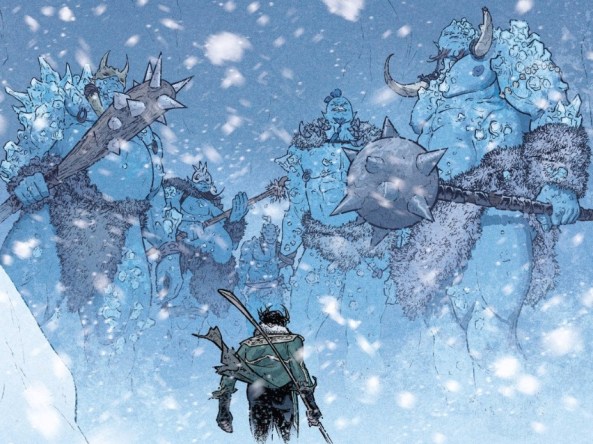
But underneath that beautiful mini-monologue, and before we get to the actual scene of Loki and his father, Dauterman draws a map of Jotunheim, subtitled “Land of the Giants.” Aaron and Dauterman start to address this setting with wide, broad strokes. “Where are we?” “Jotenheim.” “Huh?” “Land of the Giants.” “Huh?” “It’s snowy there.” “Oh sure, I got you, I got you.” But over the course of the scene, the details gradually get more specific, and what was once a map and a vague description becomes a world populated with brutal giants with their own culture. Loki has to walk through Bloodcicle Canyon (wonderfully named), where five killer giants lie in wait to murder him. Dauterman takes the opportunity to draw five distinct giants.
This is still just sort of a preview for the main event a few pages later, when we visit war-torn Alfheim. Every page offers new intriguing details – whether it be on the Swamp Mammoths and Roxxon tanks on the battle field, or Malekith’s trio of Oracles, each with what appears to be a tree decorated with eyes growing out of the tops of their heads.

Amazing designs on these things. The action here is spectacular in the most meaningful sense of the word, and I find my imagination firing on all of those cylinders. Even if I’m not actively dreaming up the backstories for everything I see: the worlds feel full.
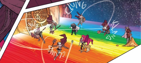
That speaks volumes about the both the design and execution from the art team on this issue. Colorist Matthew Wilson gracefully pivots between two color palettes that both heavily feature blue, but could never be confused with one another. Wilson is as responsible for signifying the switch between realms as anyone else, and there’s never a split second of confusion because of it. And Thor’s battle on the Bifrost is a technicolor fireworks display, almost unbelievable in Wilson’s bold and unapologetic use of bright colors. I know the thing is literally a rainbow bridge, but I don’t think I’ve ever seen it look this fucking cool.
That’s confidence, right there. The entire creative team only expresses themselves confidently, and the issue has an astounding sense of place and character because of it.
Taylor, my friend, how did you like this issue? I loved seeing Loki explored a little further in this issue, and it’d great to see that his new evil buddies don’t totally trust him. Rule number one when dealing with Loki: don’t totally trust him.
![]()
Taylor: Everyone says “don’t trust Loki,” and everyone says they won’t, but then they always fall prey to whatever diabolical plot he has laid anyway. I think a good rule of thumb would be to just avoid Loki at all costs, but then again, he has a way of making himself present exactly when you wish to avoid him. Such is the case when he and Thor meet at the end of the issue.
Regardless of his trustworthiness, I do agree it’s fun to see Loki explored more as a character here. In his story he appears to be trying to earn the respect of his ice-giant father. This isn’t going great and neither really seems to appreciate the other so I think it’s fairly certain that Loki is working some sort of angle here. Even it they do hate each other, I love seeing Loki and Laufey play off each other. While there’s much to be said about their differences, I most like how their preferred method of battle differs greatly. Laufey likes bashing, of course. Loki, however, uses a more nuanced weapon.
 I really enjoy how the weapon of choice for each character says so much about who they are as a character. Loki is cunning and smart and can make people rip off their own ears with just a few words. Laufey is huge and just loves clubbing things. But both of them happen to be evil and both of them need each other to accomplish the things they want to do. It’s basically a new retelling of the Odd Couple but it’s wonderful when the couple are both magical and dangerous. Also Laufey has no humor about himself whereas Loki sees the humor in almost everything. These two couldn’t be more different and that’s what makes it so fun to see them together.
This smashup of characters is possible all because of the world Aaron has crafted here. While I appreciate what he has done with these characters, I’m always in awe of the way Dauterman just makes these stories come alive. As always, there are probably dozens of great panels in this issue, but my favorite by far was a full page spread showing us the war in Alfheim.
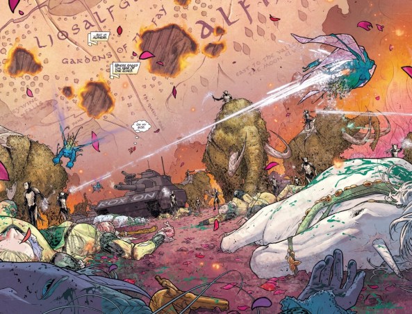
There are just so many things I love about this panel. First, I love the juxtaposition of the very human looking Roxxon tank parked among the very fantastic unicorns, fairies, and elves. This reminds me of how weird and wonderful the world of comics can be because where else are you going to see these things conflated? Another thing I like about this panel is the map in the background that locates us in Alfheim. This not only is a useful narrative tool, but Dauterman adds some symbolic flair by showing it burning, which represents the war happening at that very moment in the Alfheim. Lastly, but goddamn this is just a creative masterpiece. The dark elves are perfectly ethereal and spooky, the Swamp Mammoths are beyond weird, and the fairies zipping around make this scene totally unique. Here, Dauterman once again reminds me how there is no other artist like him in the business.
All of this incredible detail comes in one panel and hints at a universe so much deeper than what we see. I love how that depth is hinted at but never exploited and it’s sure to keep me coming back to this title indefinitely.
![]()
For a complete list of what we’re reading, head on over to our Pull List page. Whenever possible, buy your comics from your local mom and pop comic bookstore. If you want to rock digital copies, head on over to Comixology and download issues there. There’s no need to pirate, right?

For all of the amazing, imaginative details in this thing, the Swamp Mammoths are BY FAR my favorite. WHAT ARE THOSE THINGS?! I love them.
I like everything about this run except the colors. I’m not color blind but I have a terrible time distinguishing between similar colors, and every page/panel you showed in this post looks more like weird color splashes than panel art to me. I just can’t read it.
i don’t know that the color artist is doing anything wrong, he maybe is performing fantastically, but it doesn’t work for me at all.
50 pages. 50 pages into Mighty Thor, and the comic as managed to truly create a giant epic with a truly human core. Can’t think of a run that did that in two-three issues
Even in an issue with no Jane Foster, Aaron demonstrated just how right Jane Foster is for this story with the framing of thinking about her father. Her father’s simple, blue collar existence is a fascinating contrast, and the sheer simple humanity of it truly helps makes Loki’s own complex family relationship seem human even as it is epic.
And Aaron has already done a fantastic job at making the War of Realms seem big even in its opening salvo. The Dark Council is brilliant, all distinct bad guys so we get the idea of them truly being a force, especially when we see dark elves and Roxxon tanks in battle together. But what truly makes it is that we know the characters. Aaron has built Roxxon up previously, and Maliketh, Laufey, Loki and Enchantress are all characters we know. The idea of all of them working together does a great job at making it look big. And last issue and the start of this issue did a fantastic job at building Asgard, Cul and Odin as important forces, even sharing space with everything else
There is also this constant forward motion. Where Loki was introduced last issue, Enchantress is introduced this issue, being given evil order
But the true marvel is the art. Things like the burning, Lord of the Rings style map are obvious but effective ways of building a sense of scale, but even things like the simple design of creatures helps create this world. And then there is the fact that even ignoring the fantastic designs, Dauterman has great art. Enchantress, is his hands, looks dnager and alluring in a way she never has. Despite, honestly, a really silly look that should be redesigned, in Dauterman’s hands, you don’t care. His sheer skill make you forget all the problems in her design, because in Dauterman’s hands, it looks fantastic.
Damn, I’m happy that we have the Mighty Thor. With Wolverine falling to merely great after the perfect first issue, Mighty Thor is second only to the Vision when it comes to Marvel comics I’m looking forward to each month