
You know you shouldn’t judge a book by its cover, but that doesn’t mean you can’t judge the cover on its own merit. Some covers are so excellent that they pack all the drama, excitement and emotion of the whole issue into one succinct image. Sometimes they end up being their own surreal experience. And other times, we’re just exciting to see our favorite heroes kicking ass one more time. These are our top 10 covers of 2016.
10. The Unbeatable Squirrel Girl 4 – Erica Henderson
On paper, there’s nothing about Squirrel Girl’s powerset (proportional strength and speed of a squirrel, ability to talk to squirrels, etc.) that should make her “unbeatable,” but that’s precisely what makes her winning record so remarkable. Writer Ryan Q. North and artist Erica Henderson have celebrated Doreen’s resiliency at every turn, coming up with ever more resourceful ways for her to save the day. Unbeatable Squirrel Girl 4 doesn’t ultimately find Doreen defeating Doctor Doom via a Katamari of squirrels, but Henderson treats us to the image on the cover, anyway. Like many of our favorite covers, it’s a figurative approach to the conflict in the issue, one that manages to capture the tone (and humor) of the series in one unforgettable image. It’s fun, silly, and just a little bit nerdy, just like Squirrel Girl (and her eponymous series).
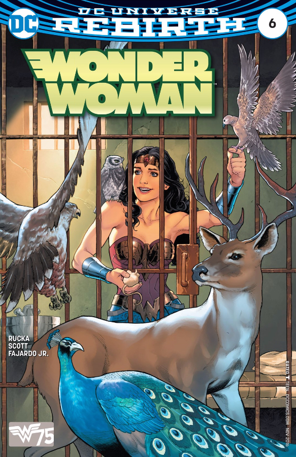
9. Wonder Woman 6 – Nicola Scott and Romulo Fajardo Jr.
Greg Rucka and Nicola Scott’s origin story for Diana of Themyscira is intentionally obtuse. Her history is revealing its own self-contradictory nature, and as such, we’re kind of left to “feel” our way around her past. In one of the series’ strongest — and still more undefined — moments, Diana is visited by animals in a Disney-Princess-esque bequeathment of divine power. Scott puts that moment on the cover of issue six, smartly keeping the bars from Wonder Woman’s cell firmly in the frame. Also, it should be noted that Scott’s one of the best figure artists in DC’s stable right now and her talent for shape and grace extends fantastically to the animals that make this cover so goddamn majestic.
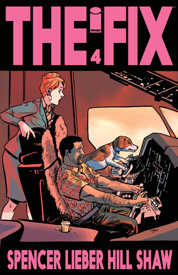
8. The Fix 4 – Steve Lieber and Ryan Hill
The black bars at the top and bottom of The Fix 4’s cover make this image appear like a frame of film, a single moment of a larger narrative frozen in time. In that instant, though, Steve Lieber and Ryan Hill manage to tell one hell of a story. The idea of a dog flying a plane is humorous on its own, but the seriousness with which Lieber and Hill treat that concept is far funnier; the horrified stewardess, overwhelmed pilots, and plane in distress are straight out of a melodramatic 70’s disaster movie — just, y’know, with a dog. While nothing even approaching this moment takes place within the issue itself, Lieber and Hill still manage to channel the themes of the issue: Pretzels’ competence vs. Mac’s helplessness, and the way Mac comes to care for Pretzels and lean on him for happiness. That’s impressive storytelling.
Plus, c’mon: it’s a dog flying an airplane. What else could you possibly want in a cover?
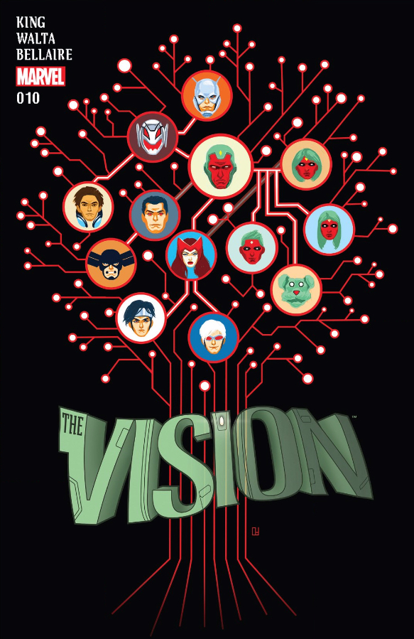
7. The Vision 10 – Mike del Mundo
Family trees are complicated affairs even for the most normal family. Steamrolling complex (and ever-changing) family relationships into a two-dimensional map is a tall order, even when you don’t have to capture the parentage of robots who received psychic imprints from humans. Mike del Mundo is able to capture an impressive amount of nuance in his schematic of the Vision’s family tree, hinting at some of the bizarre relationships while maintaining the familiar structure of a more traditional family tree. It’s that marriage of the familiar and the bizarre that makes this cover such a perfect match for this issue, which finds the Avengers’ attempt to impose a sense of normalcy on the Visions. Del Mundo reminds us, though, that this family tree isn’t quite normal, haloing it in branching circuitry. It’s a strikingly abstract cover, standing in sharp contrast to the rest of del Mundo’s covers for this series.
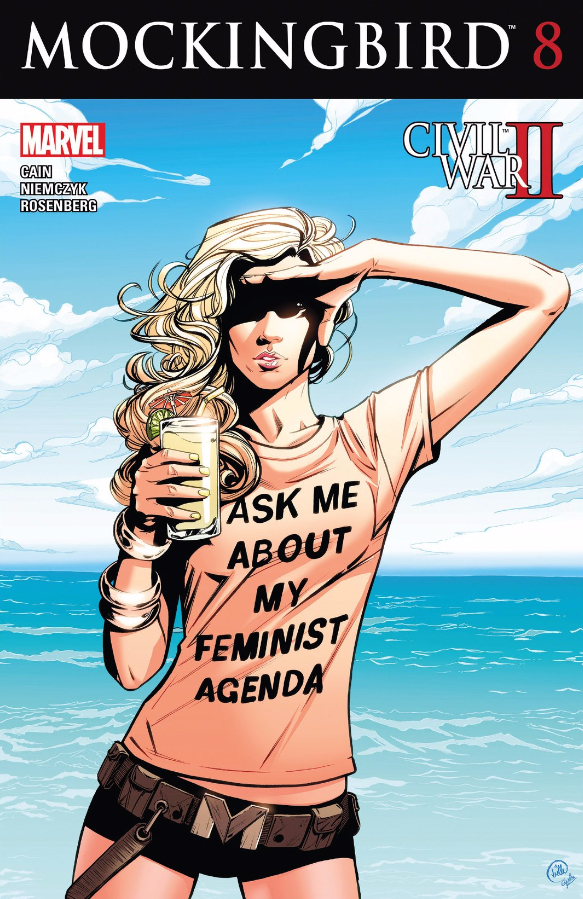
6. Mockingbird 8 – Joëlle Jones and Rachelle Rosenberg
Like many of the entries on this list, Joëlle Jones and Rachelle Rosenberg’s cover for Mockingbird 8 is a perfect summation of both the series and its star, distilling Bobbi Morse’s swagger, politics, and control over her own narrative down into a single compelling image. What makes this cover so iconic, though, is the life it’s taken on beyond this issue. When Mockingbird writer Chelsea Cain came under fire from misogynistic Twitter trolls, this cover became a rallying cry. Cain’s defenders donned their own “Ask Me About My Feminist Agenda” shirts, and many fans and creators alike are still using this cover as their avatar. Mockingbird has become a symbol of resistance for all those tired of abuse, a symbol of power for all those ready to fight back and stand up for what they believe in, and that alone may just make this the most important cover of the year. Bobbi would be proud.
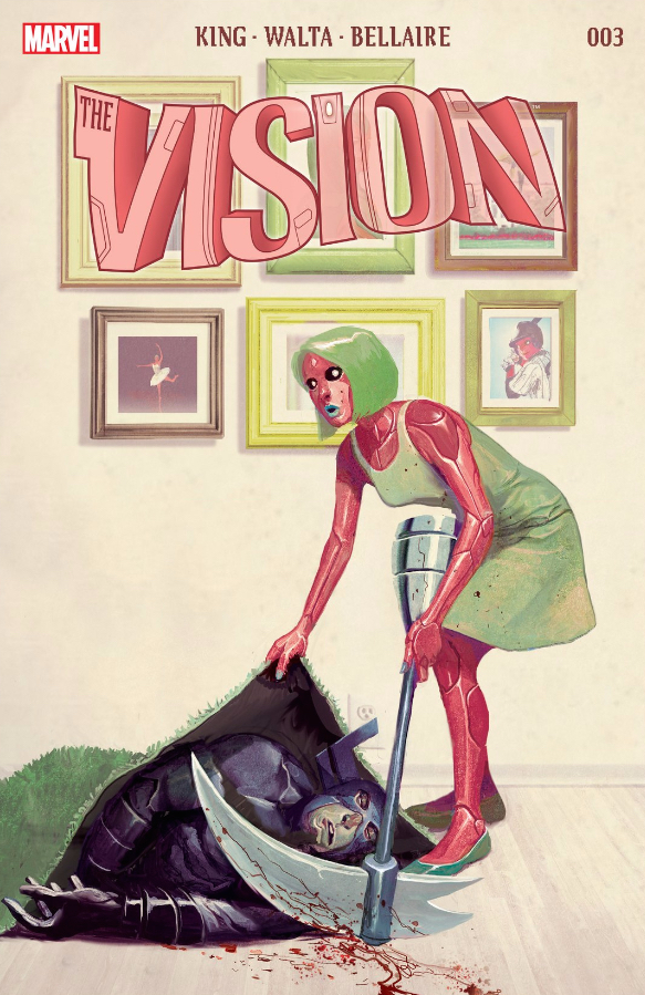
5. The Vision 3 – Mike del Mundo
We know, we know; selecting another of Mike del Mundo’s gorgeous, clever covers for The Vision comes at the expense of honoring a different artist, but these covers are just that good. Where the cover for issue 10 went abstract, this cover went figurative, manifesting Virginia’s flailing attempts to sweep her murder of Reaper under the rug. This cover not only highlights del Mundo’s knack for distilling the themes of this series down to single images, but also exemplifies how his idiosyncratic style matched those themes perfectly, landing somewhere between a Norman Rockwell and del Mundo’s own surrealist work on series like Weirdworld. The result is a cover that encapsulates the narrative at virtually every aesthetic level, perfectly capturing the otherworldliness beneath the veneer of domesticity that made this series so alluring.
3. TMNT: Bebop and Rocksteady Destroy Everything 1-5 – Nick Pitarra and Michael Garland
The premise behind Teenage Mutant Ninja Turtles: Bebop and Rocksteady Destroy Everything is as convoluted and complicated as the series’ name. The creators twist time-travel logic back over on itself so tightly, it all but breaks. Fittingly, master of visual anarchy Nick Pitarra brings that Gordian Knot of a plot to bear on the five-part cover to this mini-series. The titular duo appears like eight times in this spread, which first appears to be a trick so the single image can be used for multiple covers, but the reality is that we get to a point where we see all of these versions knocking skulls together. By comparison, the Turtles and Utroms and Time Masters (don’t ask) that litter the page seem quaint and orderly. It’s enough to convince anyone that these two knuckleheads are indeed capable of Destroying Everything.
3. Superman 10 – Patrick Gleason, Mick Gray, and John Kalisz
Let us all rejoice — Patrick Gleason is drawing Damian again! We Retcon Punchers just love that little motherfucker, and Gleason’s powerful-yet-childish take on the character is no small part of our love-calculus. Sure, sure, sure, this is an issue of Superman, but the Damian / Jon dynamic seems to dictate this whole image, bringing out the inherent tension in Bruce and Clark’s relationship. F’real — check out the body language on each of these characters and tell me that they don’t all share the same chips on their shoulders. The issue’s symmetry and total lack of background draw even further focus to the conflict that will drive the issue. And, hey, any issue that can make the internet chant “Kiss! Kiss! Kiss!” is alright in our book.
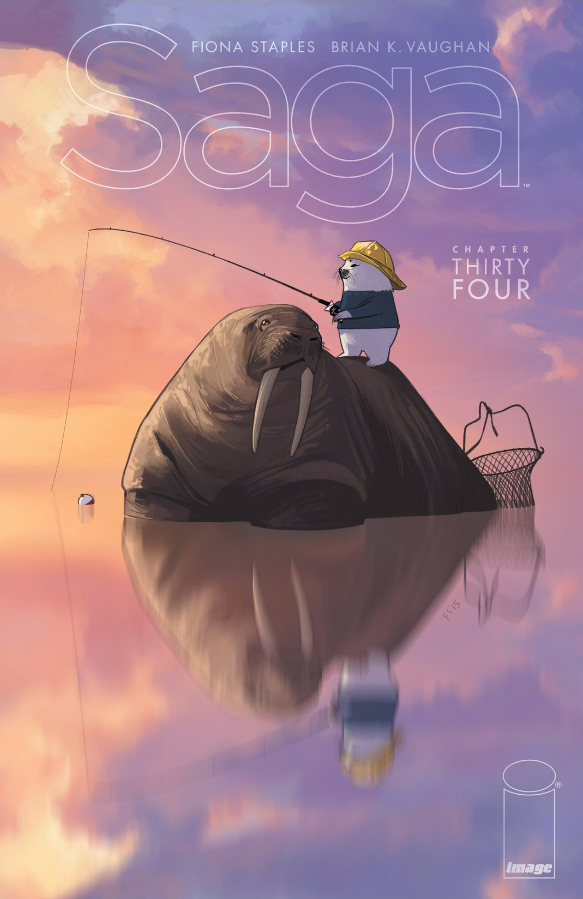
2. Saga 34 – Fiona Staples
If there’s a sure-fire way to a Retcon Punch editor’s heart, it’s Marko and Alana’s hyper adorable seal-pup fisherman buddy Ghüs. Never one to rest on her laurels, series artist Fiona Staples doesn’t just turn in a charming day-in-the-life portrait of Ghüs and his faithful walrus-y pal Friendo, but elevates that simple beauty with stunningly gorgeous color work. The calming symmetry created by the reflection in the water promises order in a series that is overwhelmingly ruled by chaos and chance. It’s no small coincidence that these two characters are at the center of this serenity. The issue itself flashes around to host of uneasy character-pairings: Upsher and Doff traveling with The Will, Hazel and her teacher, even Sir Robot and his son with Marko and Alana. The only friendship that appears to come without judgement or agenda comes from these two.
1. The Mighty Thor 11 – Russell Dauterman and Matthew Wilson
Russell Dauterman and Jason Aaron have been playing a fascinating game of superhero Three Card Monte with Jane Foster and Thor. They are the same — Jane is pointedly not “Lady Thor” or “Thoress” or something like that — but the agency and identity of Mjölnir reveals a seemingly bottomless pit of mystery about how they’re different. Mighty Thor 11 puts both Jane and Thor on the cover, charging in against colorist Matthew Wilson’s otherworldly electric blue background, highlighting both the alien and godly aspects of the Thor character. Dauterman’s covers have also found fascinating ways to challenge the role of the title on the page, here rotating it 90 degrees, and almost acting as a vanguard for its pair of singular heroes. It’s also exhilarating to see the frail Jane charging in with the same fervor as the decked-out Thor.





I’m sure folks have a lot of favs that didn’t make the list. I personally could have happily made a list with just The Vision and Mighty Thor covers, but I’m pleased with the diversity of this list. What were some others that we missed?
Yeah, I had a LOT of Mighty Thor covers on my initial list.
I’m honestly really happy with the final list, but a few other covers I considered were:
The Woods 25 (a really gorgeous shot of the Black City, with this cool otherworldly shade of color to it)
Spider-Woman 5 (I must have a thing for blue backgrounds)
Patsy Walker 2 (some of Marvel’s finest women just hanging out eating lunch)
This is always a really diverse category just because everybody has such different taste when it comes to covers, and I’d love to hear more people’s picks too
I skipped Thor and Saga as you guys listed them already, although I’m not sure the Thor would have made my list. I ended up with 16, after some pruning I ended with 11 and can’t be swayed. (I never know if you’ll see these or not or if you’ll have to follow the links
11) Black hammer #2 – Giant robot destroying the city.
https://www.darkhorse.com/Comics/26-733/Black-Hammer-2#
10) Cannibal #1 – The bloody mist has permeated the swamp. And it’s waiting for you.
9) Daredevil #14 – Those eyes.
8) Spider-Man #3 – Such an awesome image of what it must be like to be a teenage superhero.
Hey Greg! Sorry these were getting swatted down by our spam filter (it doesn’t like links, evidently). You’re good now.
No worries. It looks like my #5 – #1 is waiting moderation still, but I understand the filters. It’s a lot of images. I was excited, i actually planned for this this year.
One year I should consider planning for this…
At least this year, I am actually preparing my ‘Why I love Comics in 2016’ thing so that I’ll have it ready. Already longer than last years, which surprises me.
7) Carnage #6 – Carnage had great covers all year.
http://cbr2.imgix.net/wp-content/uploads/preview/CARNAGE2015006-DC11-0c9fd.jpg?auto=format&lossless=1&q=90&w=418&h=645&fit=crop
6) Lake of Fire #4 – This is what the players in my D&D game feel like right now waiting on next Tuesday. (I could have taken issue one also, which was awesome.
I’m just going to discuss a bunch of stuff, ignoring many, many great covers
If you have to choose the best Vision cover, it is certainly 3. So many great ones, but that is the best.
I actually think you are giving Mockingbird 8’s cover a disservice by focusing entirely on the controversy attached. Because even without the idiots, it deserves to be on the list. Literally every part of the cover is tailor designed to perfection. It is easy to discuss how great Bobbi’s shirt is, but what really makes it work is how perfectly that shirt fits the comic. It tells us everything, from the fact that Bobbi is dressing down for a holiday to her politics to her sense of humour. It is hard to think of an example of clothing being more carefully crafted on a cover. Same with everything from stance to props to background. This is a sensational cover, and not just because of idiots who don’t know about the Streisand Effect.
If there is one thing that I think is missing, it is Batgirl 50. Batgirl 35’s cover was a masterpiece, and instantly iconic. And Batgirl 50 is the perfect callback. The way it riffs on the cover, but builds on the ideas to show how things have changed is fantastic. Going from the lonely first cover to the cramped selfie of all of Batgirl’s allies really sells the arc of the book, and all five of them are full of character in a way that is often rare. One of my favourites
You know what would be an interesting Best of list? List of series with the best covers. Because as has been mentioned several times, the Mighty Thor and the Vision had astonishing covers. And while I don’t think I could argue that any single cover of Omega Men is good enough to be called best, I can’t think of a series that has better covers when taken as a sum total. The fact that literally every cover is of a defaced poster (usually propaganda) is such a fantastic idea at building that revolutionary concept, especially as the titles themselves are part of the defaced cover. Taken as a set, instead of judged individually, Omega Men has the best covers
I’m not going to pretend it is easy to choose the greatest Mighty Thor cover, but my opinion would actually be Issue 12. Fantastically original, so different in stands out and really sells the sense of motion. No better cover for the Secret Origin of Mjolnir.
Hulk 1 was released in the nick of time, but is an instant stand out. SO is Hawkeye 1’s movie pitch perfect movie poster look.
Lee Bermejo’s fantastic covers for We Are Robin cannot be forgotten, nor can his cover for Robin War 2 (which came out at the very beginning of the year). We Are RObin wasn’t good, but the covers were worth the asking price. I’m a really big fan of Issue 11, with Duke.
Black Canary 10 and 12 are truly emotive. Can’t think of covers where the personalities are stronger
Alex Ross has been doing fantastic work. His Captain America one was disappointing, but there are a handful of great ones he’s done for AVengers, including issue 8, and Amazing Spiderman, including 16. But his Secret Wars stuff deserves praise. That final issue of Secret Wars has an astonishing cover.
Capullo’s Batman 48 is a perfect example of colourful horror. A masterclass.
I wasn’t American Alien’s biggest fan, but damn that had some great covers
Spiderwoman has some consistently great covers, and I’m a big fan of the ones for the Civil War tie ins. Especially Jessica upside, investigating Clint’s arrows
Kris Anka did truly amazing poster style covers for Captain Marvel. Worked really well.
Weirdworld’s covers were usually defined by the insanity we expect from Weirdworld, but I prefer the quieter, more intimate cover of issue 6, with Becca staring at the Earth. Perfect
Star War 21 just works so well.
DC Bombshells has so many fantastic covers that it is hard to call some out. Among the best at portraying emotion, frequently powerfully kinetic but alwyas standing out and astonishing.
Nice call on Batgirl 50; I loved that cover too, but totally missed it as I looked through the last year’s worth of covers, somehow.
Hulk 1 got stuck in that limbo where it was released after we submitted our nominations, but before we released our lists, sadly. I’ll echo both of you that it’s a fantastic cover.
I like your thoughts on “series with the best covers.” I had a similar thought last year, when I nominated “All the ‘Fade Out’ covers.” That, obviously, didn’t make it to the final list.
I think when I pruned our library to just series currently in publication, I forgot how essential going through the library is to generating these lists. In the future, I think I’ll reserve such spring cleaning for new years to avoid this kind of confusion.
What I love about Batgirl 50 is how it tells a story. It takes one of the best and most iconic covers of recent memory, and plays with it so cleverly that it isn’t a rip off, but tells a story. How it creates something new from something old is fantastic. It feel satisfying to look at the Batgirl 50 cover, knowing what the original cover looked like. I love it
And yeah, individual issues of the Fade Out and Omega Men are great covers, but not among the best. But when you see them all together, they really take a life of their own.
Oh, and there is a reason I have been using solicitations to craft my ‘Why I love Comics’ list. Helps make sure that nothing gets forgotten. Because the Hulk cover is too good not to be given a shot
#5) Spider-Man 2099 #11 – Reflections always make good covers.
#4) Seven to Eternity #2 – Another series with all great covers.
#3) Amazing Spider-Man #14 – Ross did a good job on all Spider-Man this year, but this image of Regent is boss.
#2) The Ultimates #5 – The End of Time is pretty cool
and finally…
#1) Conan the Slayer #3 – This is awesome. I’d buy this poster.
Oh, and as Matt said. Hulk #1 is on the list somewhere. It has to be.
Shout out to the Paper Girls covers. They’re nothing fancy, but they reflect the heart of the series perfectly. And the pastel colors really pop off the shelves (so much that I saw some books copy that approach winter, a bit shamelessly). If I had to pick one, I’d go with #8 (Mac in the mirror) or #10 (all the Erins). The shopping mall of #7 was pretty great, too.
Best series of variant covers: Jeff Lemire’s own variants for Black Hammer.
Other awards….
Historic cover that I’m sick of, because it was EVERYWHERE: Champions #1
Most awesome cover for a book that hasn’t delivered on its promise yet: The Skeptics #1
Consistently worst covers for a great book: Doctor Strange. So many bland ones….
Think you are being slightly harsh on Doctor Strange. Has some really bad ones, but also some really good ones (especially the latest two). There are so many other series that deserve hate more than Doctor Strange for their consistent blandness