by Drew Baumgartner
This article contains SPOILERS. If you haven’t read the issue yet, proceed at your own risk!
![]()
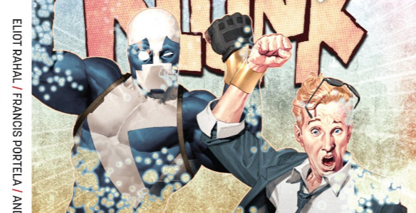
Our sense of color is intuitive, but I think that makes it harder for comics colorists to achieve true verisimilitude. Readers may not have a sophisticated understanding of color theory, but they still know when something looks wrong. And “wrong” can be anything from shadows and highlights to textures to atmospheric effects. We might only be able to articulate the most attention-getting aspects of comics coloring, but subtler choices have a profound impact on the believability of the art. Those choices can be simple, as they are in Quantum and Woody 6, but it’s the skill with which colorist Andrew Dalhouse pulls them off that ultimately makes them work.
And I get that “simple” is really selling Dalhouse’s work here short. It’s easy for me to look at these pages and remark on the orangey glow of the fire and the cool blues of Washington D.C. in a blackout, but there’s a lot more going on here. Even so, look how effective those simple color choices are at differentiating between Quantum and Woody’s respective rescues:

I know just enough color theory to recognize those complementary colors as helping to really make this page vibrant, but it’s in the smaller details where Dalhouse really reveals his strengths. Look at how the harsh rim lighting on Quantum (and Woody in that last panel) reinforce our notion of where the fire is. Look at how Dalhouse washes out the linework in the backgrounds to give these panels a sense of depth. Look at how he adds elements like floating cinders and smoke to make the spaces feel more tangible. There’s so much more going on here than the color choices, and every piece helps draw us further into the reality of these scenes.
The simple orange/blue narrative gets more complicated as the issue wears on, but Dalhouse’s commitment to selling the lighting and atmosphere of every moment shines throughout. I love the dust wreathing every panel after the building collapses, but the best storytelling moment in those final pages has to be the light breaking through as rescuers unearth Quantum and Woody:

I’m sure that’s a detail that was specifically called for in the script and carried out in close coordination with artist Francis Portela, but it’s Dalhouse that has to make it sing. It’s a little beat of story that’s told exclusively with color, carried off perfectly. Not many series rely on their colorists quite like this, but this issue makes me hope more start.
![]()
The conversation doesn’t stop there. What do you wanna talk about from this issue?
