by Taylor Anderson
This article contains SPOILERS. If you haven’t read the issue yet, proceed at your own risk!
![]()
When I think about it, the very idea of a full page spread seems pretty audacious. Given that a creative team has only twenty pages to tell their story, the act of devoting two full pages to single panel means that image better be damn impressive. More than that, it needs to convey emotion, theme, and character to really give the image the emotional impact its two pages demand. But what happens if a full page spread doesn’t do these things – what does that look like?
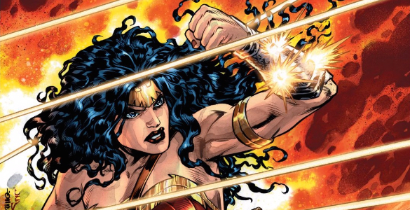
Diana is taking Etta Candy home from the hospital and feels that it is her responsibility to protect her during her recovery. The one problem with this plan is that Diana attracts danger wherever she goes, so it isn’t too long before her and Etta are attacked by an assassin. After Mayfly tries to take out Etta with a sniper rifle, Diana flies to her would be assassin in an action that is depicted in a full page spread.
If you’re underwhelmed by this panel, you are not alone. There’s a lot going on here that undermines the impact I think Shea Fontana and David Messina were hoping for when they planned out this spread. First, and most noticeably, there is a lot of empty and unused space here. Look just to the right of Diana and you’re rewarded with a lovely view of a brick building. Nothing about this is dynamic and it seems like something more fitting as a backdrop than the center stage it takes here. When there is something to look at, the panel isn’t much better however. Looking at Diana, there is nothing exciting about her positioning or the way the camera falls on her. In this scene Diana is flying across an ally to stop an assassin but none of that action is conveyed here. This paired with the fraction of Mayfly’s helmet in the lower right hand corner makes me wonder what type of discussions were had about the placement of the two primary subjects of interest in this spread.
Because of these faults, it’s hard to for this panel to make much of an impact in the issue. Lucky for it, the rest of the issue doesn’t fare much better in the art department. There are irregular figures drawn throughout and often the action that takes place between panels is confusing at best. So despite the creators’ desire to convey action on an issue-wide level, things get bogged down by the sloppiness of the execution.
![]()
For a complete list of what we’re reading, head on over to our Pull List page. Whenever possible, buy your comics from your local mom and pop comic bookstore. If you want to rock digital copies, head on over to Comixology and download issues there. There’s no need to pirate, right?
