by Drew Baumgartner
This article containers SPOILERS. If you have not read the issue yet, proceed at your own risk!
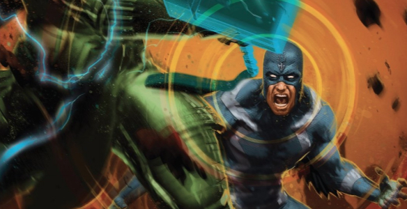
![]()
Deep, thoughtful analysis is a rarity in the world of comics criticism. While it’s easy enough to dismiss itinerant continuity policing or grumbling about plot-holes as braindead drivel, there’s a much more insidious kind of shallow analysis that suggests that there are simple aesthetic rules that govern the medium. It may be possible to identify trends that are true for even a very large sample of comics, but there are just as many exceptions to those “rules.” Truly deep analysis, on the other hand, can introduce us to new analytical tools that can be applied to many other comics, even if the conclusions we draw from those applications have no universal trend. Such is the case with Matt Fraction’s “cover version: daredevil 230 and cutting techniques,” one of my favorite comics analyses of all time. I highly recommend taking the time to read that piece, but the short explanation for why I love it so much is that it introduced me to ideas I had never encountered before. Most important was the thought that the invisible structures that guide our reading experience might be only just invisible, and that we can unearth them by paying close attention to things like panel counts and layouts. Fraction identifies a triangle motif in Daredevil 230 that is obvious enough on some pages, but on others just loosely describes the areas of the layouts we might most pay attention to. Using those same techniques, I recognize a similar pattern on some pages of Death of the Inhumans 3, though they elicit a decidedly different effect.
Let’s jump right in with the first of those pages:
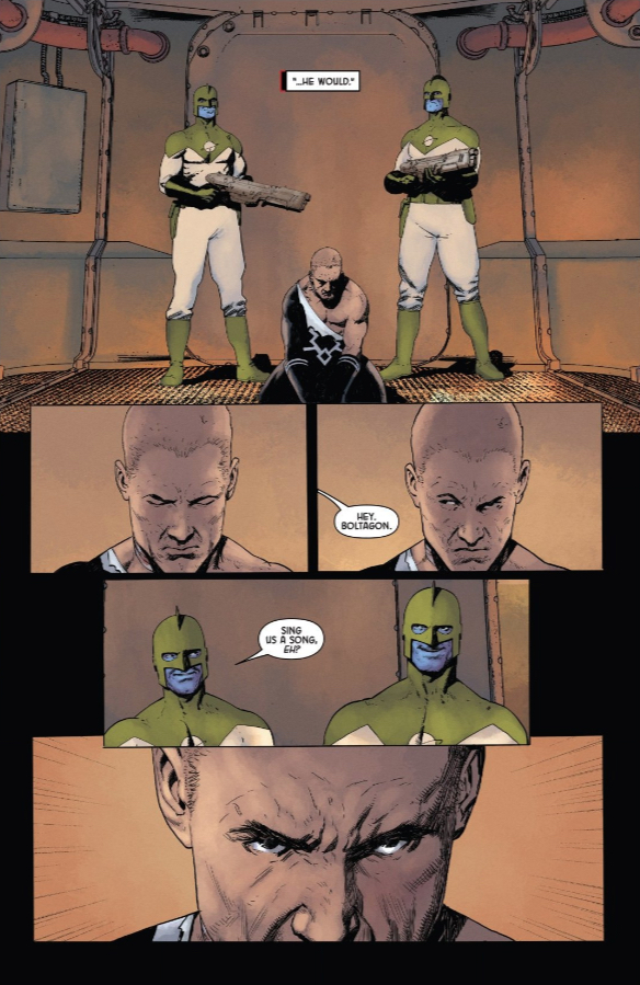
If you’ll forgive me, I didn’t want to mark up Ariel Olivetti and Jordie Bellaire’s gorgeous artwork, so we’ll just have to imagine the narrow v shape that we can draw from the guards’ faces in the top panel to Black Bolt’s close up at the bottom of the page. The effect is a kind of funneling of our attention, cramming this tinderbox of a situation into an ever smaller space (with ever tighter shots), until the sequence comes to a literal head.
Olivetti uses a similar technique on the very next page:
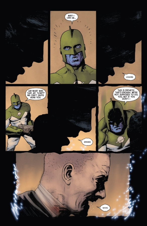
There are triangles everywhere on this page. You can connect the three silhouettes of Black Bolt for one, the three reverse-shots of the guard for another, and everything funnels down to that final panel, giving us a final focal point before Olivetti breaks with this motif. Here again, the effect is to drive a sense of claustrophobia, pointing irrevocably to the inevitable conclusion, though the guard’s triangle is trying desperately to fight its way upstream. It’s the kind of tension you definitely feel, even if you can’t quite put your finger on why.
It’s a device Olivetti returns to one last time before the big reveal of Medusa’s ringer, helping to hype up a mystery character Donny Cates’ script is already maxing out our anticipation for. We’re already at the edge of our seats, but Olivetti manages to tweak the tension up just that much further by recalling those earlier pages — even subconsciously. It’s brilliant, subtle work that manages to keep even this mid-arc issue tense and engaging.
![]()
For a complete list of what we’re reading, head on over to our Pull List page. Whenever possible, buy your comics from your local mom and pop comic bookstore. If you want to rock digital copies, head on over to Comixology and download issues there. There’s no need to pirate, right?

Hi greatt reading your post