by Drew Baumgartner
This article contains SPOILERS. If you haven’t read the issue yet, proceed at your own risk!

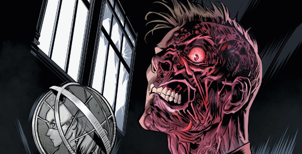
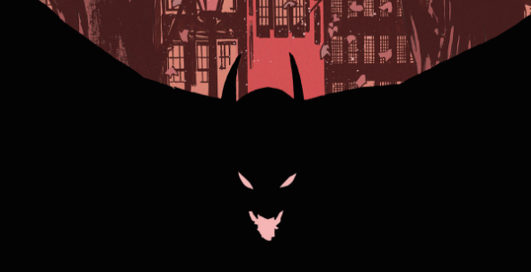
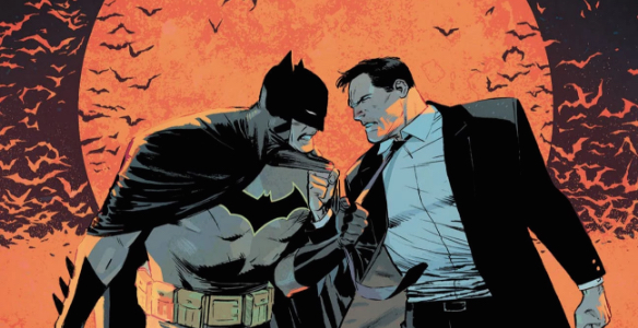
We’ve written a lot over the years about how the disparate tones of various incarnations of Batman have created a kind of range that the character operates in. Maybe he’s light and campy, maybe he’s dark and serious. Maybe he’s a high-tech wizard, maybe he’s a low-tech sleuth. Maybe he’s a bitter loner, maybe he’s cultivating an ever-growing family of friends and allies. That range applies just as much to the look of Batman, as different character designs emphasize different aspects of his character. Is his costume scary, or silly? Is humanity obscured by his costume, or made more obvious by it? In practice, the platonic image of Batman we keep in our minds might be just as diffuse as his mood — a kind of pastiche of the designs from, say, our favorite comics runs, Batman: The Animated Series, and maybe even a few movies. High in the mix for most modern comics fans, though, must be David Mazzucchelli’s distinctively line-smart Batman: Year One, which distilled Batman down to as few brush strokes and dabs of color as possible, creating a kind of shorthand iconography for the character that perfectly suited the early-days nature of that story. It’s a style that Lee Weeks and colorist Elizabeth Breitweiser evoke in Batman 52, though rather than celebrating that iconography, they’re interrogating it. Continue reading